library(ggplot2) # package to construct graph

library(gcookbook) # we will use dataset from this packageIntroduction to ggplot2 package
Introduction
This is a simple lecture notes explaining the practical use of ggplot2 package to construct graph. The aim of this topic is to produce useful graphics with ggplot2 as quickly as possible.
At the end of the topic you should be able to:
Know the 3 components of every plot:
dataastheticsgeoms
How to add additional variables to a plot with aesthetics
How to display additional categorical variable in a plot using small multiples created by faceting.
A variety of different
geomsthat you can use to create different types of plots.How to modify axes.
Things you can do with a plot object other than display it, like save it to disk.
Reference: (Gómez-Rubio 2017)
ggplot2 is a powerful and widely used data visualization package for the R programming language. It is built on the Grammar of Graphics, a general framework for creating plots that was introduced by Leland Wilkinson in his book of the same name. ggplot2 provides an easy-to-use, yet powerful, system for creating complex and highly-customizable data visualizations.
One of the key features of ggplot2 is the ability to separate the data, the aesthetics, and the scales of a plot. This allows for a high degree of flexibility and control when creating plots, and makes it easy to create multiple variations of a single plot with minimal changes to the code. ggplot2 is built on a layered architecture, which allows you to easily add new elements to a plot, such as points, lines, or text, and to control their appearance by adjusting various aesthetic attributes. This allows for a high degree of control over the final appearance of the plot.
Another important feature of ggplot2 is the ability to easily customize the appearance of the plot by using a variety of built-in scales and themes. These scales and themes can be adjusted to change the colors, font sizes, and other elements of the plot to match a specific style or branding guidelines. ggplot2 is widely used by data scientists, researchers, and analysts to create publication-quality data visualizations, it is also used in many R-based data visualization libraries such as shiny, shinydashboard, etc.
Basic Function
Calling the library
By using dataset pg_mean from gcookbook package, let’s look at the structure of the dataset.
str(pg_mean)'data.frame': 3 obs. of 2 variables:
$ group : Factor w/ 3 levels "ctrl","trt1",..: 1 2 3
$ weight: num 5.03 4.66 5.53For any graph using ggplot2 package, we need to specify these code:
ggplot(pg_mean,
       aes(x=group, y=weight))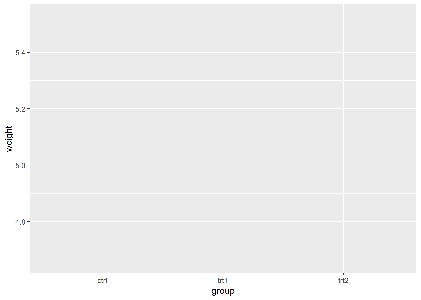
Notify that this is the blank graph because we did not specify any graph to be plotted. The basic are define the dataset name, then for aesthetic argument, we need to specify the variable for x-axis and y-axis. To proceed with plotting graph, we need to add geom function after the basic ggplot function. There are several geom function available to develop a graph. For example:
geom_bar()–> bar chartgeom_line()–> line chartgeom_point()–> scatterplot / point chartgeom_histogram()–> histogramgeom_boxplot()–> boxplotgeom_smooth()–> regression line (and many purposes)
Simple bar chart
Simple bar chart is to visualise the single qualitative variable. A simple bar chart, also known as a bar graph, is a way to display data using rectangular bars. The length of each bar is proportional to the value of the data point it represents. Each bar is typically labeled with the data point’s value and the bars are usually organized along the x-axis, with the y-axis indicating the scale of the data. Bar charts are commonly used to compare data across different categories or to show changes in data over time.
To create a simple bar chart using group variable in pg_mean dataset and measure the group using weight:
ggplot(pg_mean,
       aes(x=group, y=weight)) +
  geom_bar(stat="identity")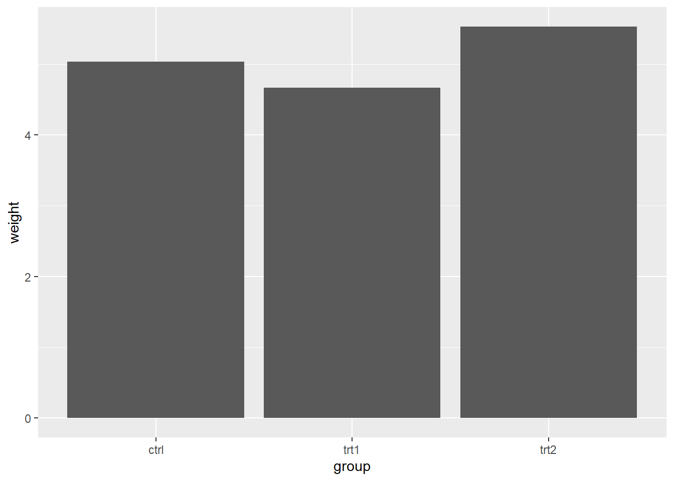
In geom_bar function, we use stat="identity" argument because we want R to measure the group variable using y=weight.
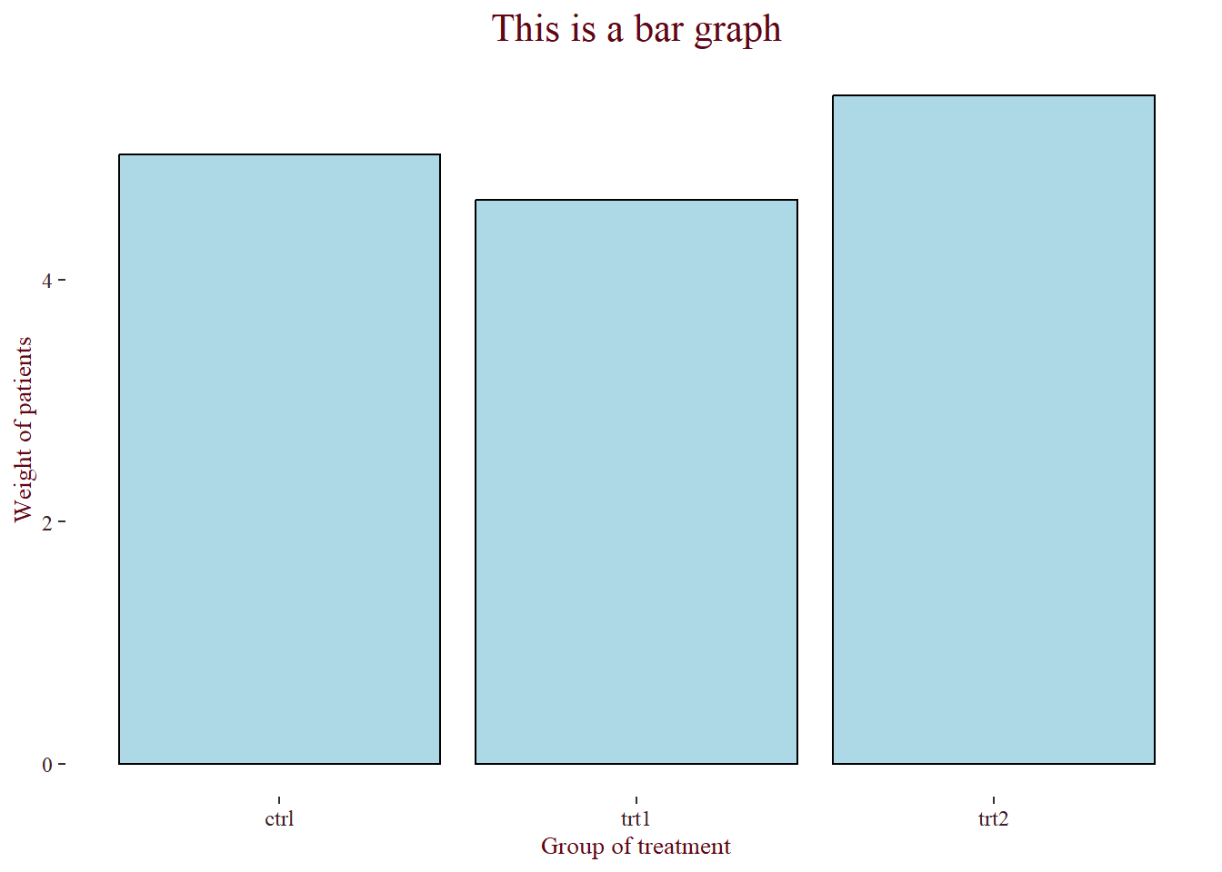
To input colour in bar, we can use “colour” and “fill” argument into geom_bar. To give title for the whole graph, we use ggtitle function, xlab is for title for x-axis, ylab is for title for y-axis. The theme function is use to modify the graph theme.
ggplot(pg_mean,
       aes(x = group , y = weight)) +
  geom_bar(stat="identity", colour="black",
           fill="lightblue") +
  ggtitle("This is a bar graph") +
  xlab("Group of treatment") +
  ylab("Weight of patients") +
  theme(panel.background = element_rect(fill="#FFFFFF"),
        plot.title = element_text(hjust=0.5,
                                  family="serif",
                                  size = 16,
                                  colour= "#600716"),
        axis.title.x = element_text(family="serif",
                                    size = 10,
                                    colour= "#600716"),
        axis.title.y = element_text(family="serif",
                                    size = 10,
                                    colour= "#600716"),
        axis.text.x = element_text(family="serif",
                                   size = 9,
                                   colour= "#3F2126"),
        axis.text.y = element_text(family="serif",
                                   size = 9,
                                   colour= "#3F2126"),
        )
Situation where we did not specify the y-axis variable, we should not input stat="identity" in the geom_bar function.
ggplot(mtcars,
       aes(x=as.factor(cyl))) +
  geom_bar()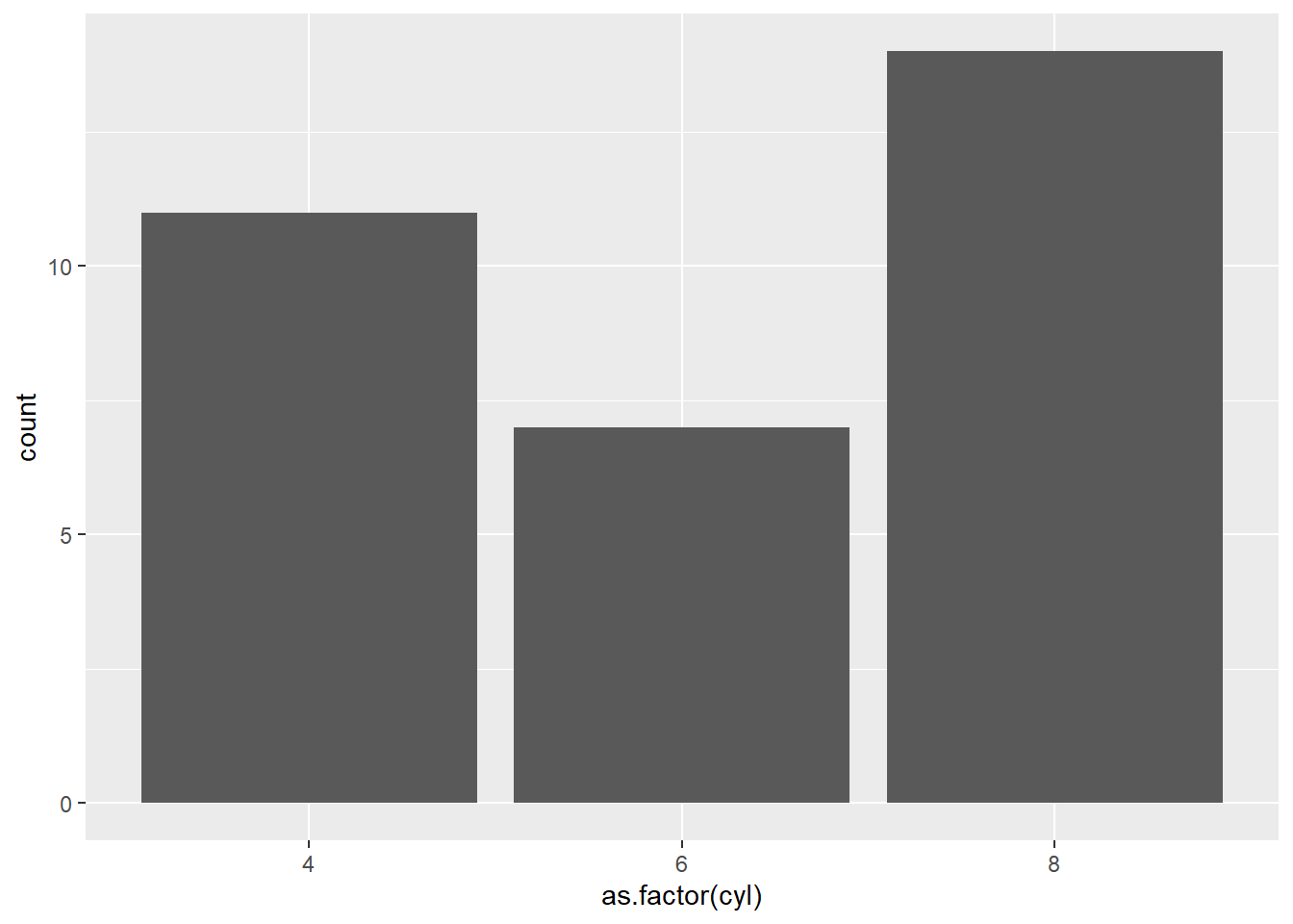
Add come colours
scale_fill ()
The scale_fill_*() functions in the ggplot2 package in R are used to set the fill color of the bars in a bar chart. Some commonly used scale_fill_*() functions include:
scale_fill_gradient(): creates a gradient fill for the barsscale_fill_gradient2(): creates a two-color gradient fill for the barsscale_fill_manual(): allows you to manually specify the fill color for each barscale_fill_brewer(): uses predefined color palettes from the RColorBrewer packagescale_fill_hue(): maps the fill color to a continuous variable using a specified color mapscale_fill_grey(): maps the fill color to a continuous variable using a greyscale color mapscale_fill_distiller(): uses predefined color palettes from the RColorBrewer package, but with a greater number of colorsscale_fill_gradientn(): creates a n-color gradient fill for the bars
ggplot(mtcars,
       aes(x=as.factor(cyl), fill=as.factor(cyl))) +
  geom_bar() +
  scale_fill_manual(values =
                      c("#F1FC93", "#C1FC93", "#93FCDE")) +
  theme_light()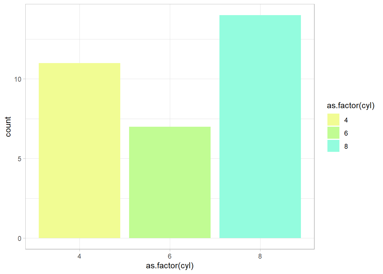
Cluster bar chart / multiple bar chart
A clustered bar chart, also known as a grouped bar chart or side-by-side bar chart, is a way to display data using multiple bars for each data point. Instead of having one bar for each data point, a clustered bar chart has multiple bars that are grouped together to represent different categories or subcategories of the data. The bars are typically organized along the x-axis, with the y-axis indicating the scale of the data. Clustered bar charts are useful for comparing data across different categories or subcategories, and for showing changes in data over time.
For example, you might use a clustered bar chart to compare the sales of different products across several months, where each product is represented by a group of bars, one for each month. Each group of bars would be color-coded or labeled to indicate which product it represents, and the length of each bar would be proportional to the sales for that product in that month.
Another example is when you have several subcategories with values for each category. With the help of clustered bar chart, you can see the subcategories value side by side with different categories.
data("cabbage_exp")

#to make a bar graph for Date and weight, cluster
# by cultivar

ggplot(cabbage_exp,
       aes(x=Date, y=Weight, fill=Cultivar)) +
         geom_bar(stat="identity",
                  position = "dodge", #cluster
                  width = 0.8)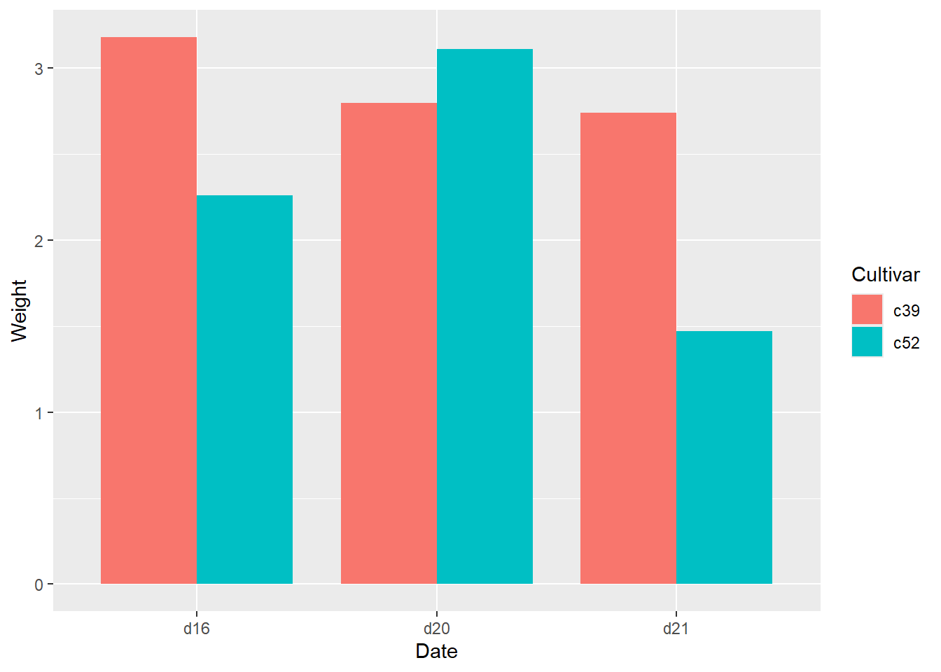
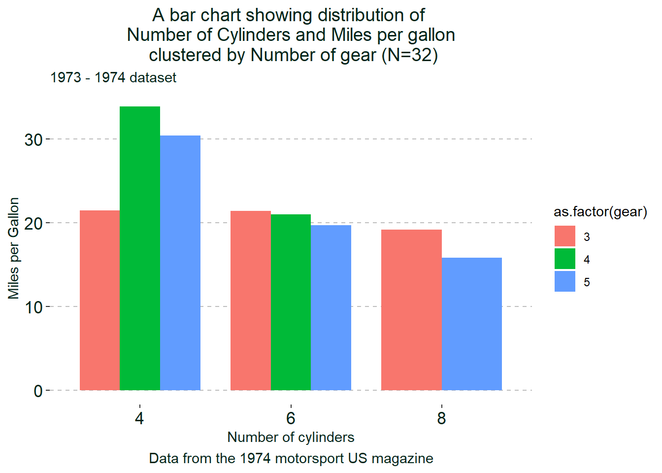
Another example, we want to create a bar chart for cyl, and mpg, clustered by gear
ggplot(mtcars ,
       aes(x=as.factor(cyl), y=mpg,
           fill = as.factor(gear))) +
  geom_bar(stat="identity", position = "dodge",
           width = 0.8) +
  labs(title = "A bar chart showing distribution of \n Number of Cylinders and Miles per gallon \n clustered by Number of gear (N=32)",
       x = "Number of cylinders",
       y = "Miles per Gallon",
       subtitle = "1973 - 1974 dataset",
       caption = "Data from the 1974 motorsport US magazine") +
  theme(
    plot.title = element_text(hjust = 0.5,
                              family = "Times",
                              size = 14,
                              colour = "#02251B"),
    axis.title = element_text(family = "Times",
                              size = 11,
                              colour = "#02251B"),
    plot.subtitle = element_text(family = "Times",
                                 size = 11,
                                 colour = "#02251B"),
    plot.caption = element_text(hjust= 0.5, family = "Times",
                                size = 11,
                                colour = "#02251B"),
    panel.background = element_rect(fill = "#FFFFFF"),
    plot.background =  element_rect(fill = "#FFFFFF"),
    panel.grid.major.y = element_line(linetype = 2,
                                      size = 0.5,
                                      colour = "grey"),
    axis.text = element_text(family = "Times",
                               size = 13,
                               colour = "#02251B"),
    legend.key = element_blank(),

  )
Stacked bar chart / component bar chart
A stacked bar chart is a way to display data using multiple bars for each data point, similar to a clustered bar chart. Instead of grouping the bars together as in a clustered bar chart, the bars in a stacked bar chart are stacked on top of each other to represent different categories or subcategories of the data. The bars are typically organized along the x-axis, with the y-axis indicating the scale of the data. The total length of the stacked bars for each data point represents the total value of that data point.
In a stacked bar chart, the height of each bar represents the total size of the category and the different colors or patterns within the bar represent the subcategories that contribute to the total. Each subcategory’s value is represented by the length of the segment of the bar which is proportional to the subcategory’s value relative to the total.
A stacked bar chart is useful when you want to show how different parts contribute to a whole, especially when the parts are related to the whole. For example, you might use a stacked bar chart to show the percentage of total sales made up by different product lines within a company, with each product line represented by a different color or pattern within the bar.
#stacked bar chart / component bar chart
ggplot(cabbage_exp,
       aes(x=Date, y=Weight, fill=Cultivar)) +
  geom_bar(stat="identity", width=0.7)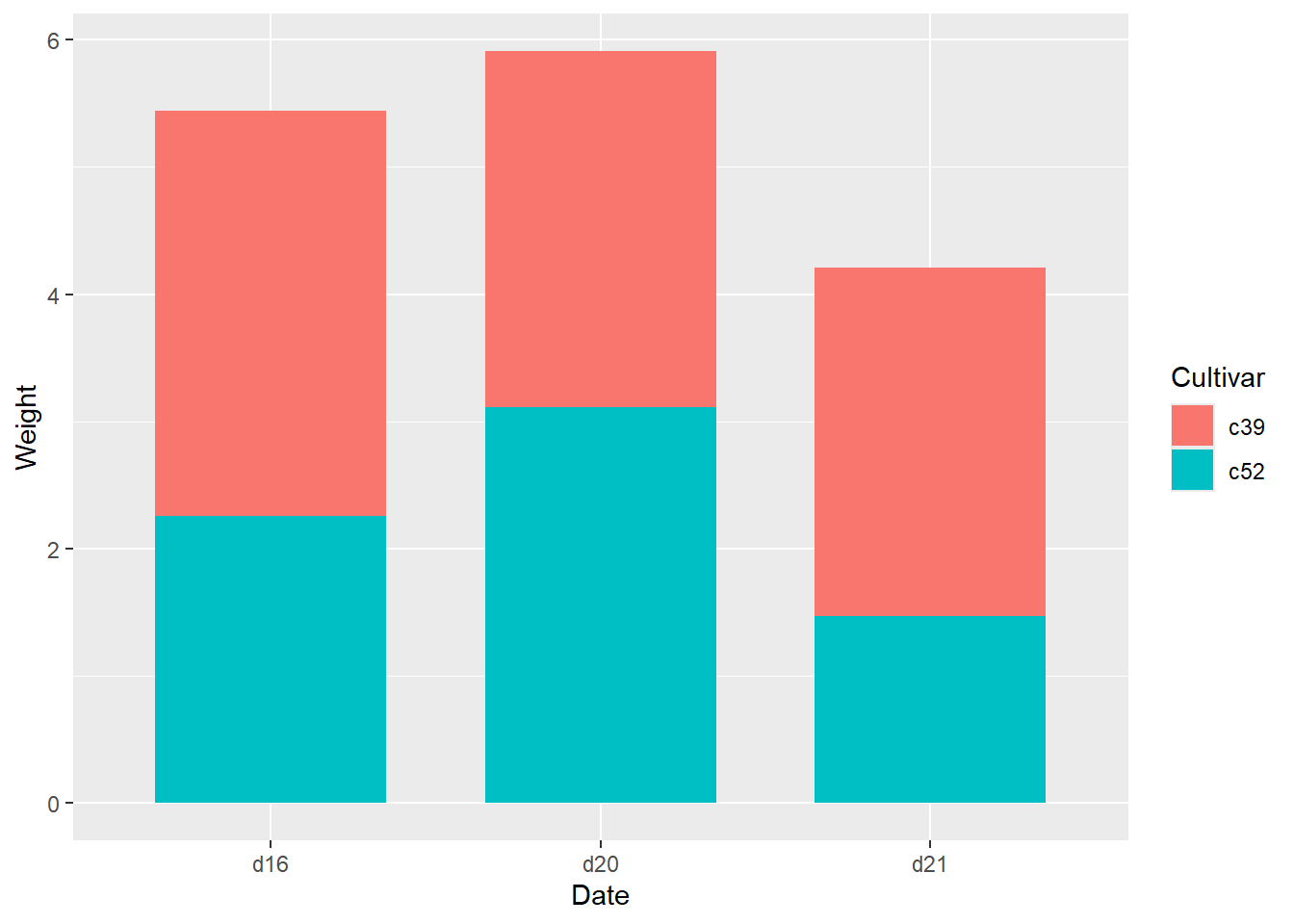
Line Chart
A line chart, also known as a line graph, is a way to display data using a series of connected data points. The data points are typically represented by small circles or other symbols, and the line segments connecting them show the changes in the data over time or across different categories. The x-axis typically represents the time or category, while the y-axis represents the scale of the data. Line charts are commonly used to show trends or changes in data over time, such as stock prices, weather patterns, or population growth.
Line charts can be used for multiple types of data, such as continuous, discrete, and categorical. Line chart can be used to show the change in a variable over time, relationship between two variables, the distribution of the data, or to compare the trends among different groups. The line chart can be univariate, showing one variable at a time, or multivariate, showing more than one variable at a time, with different colors, patterns or symbols to differentiate among them.
It’s worth noting that there are several variations of line chart, such as, stacked line chart, multi-series line chart, etc.
BOD Time demand
1 1 8.3
2 2 10.3
3 3 19.0
4 4 16.0
5 5 15.6
6 7 19.8ggplot(BOD,
aes(x=Time, y=demand)) +
geom_line(linetype =1, size = 1,
colour = "red")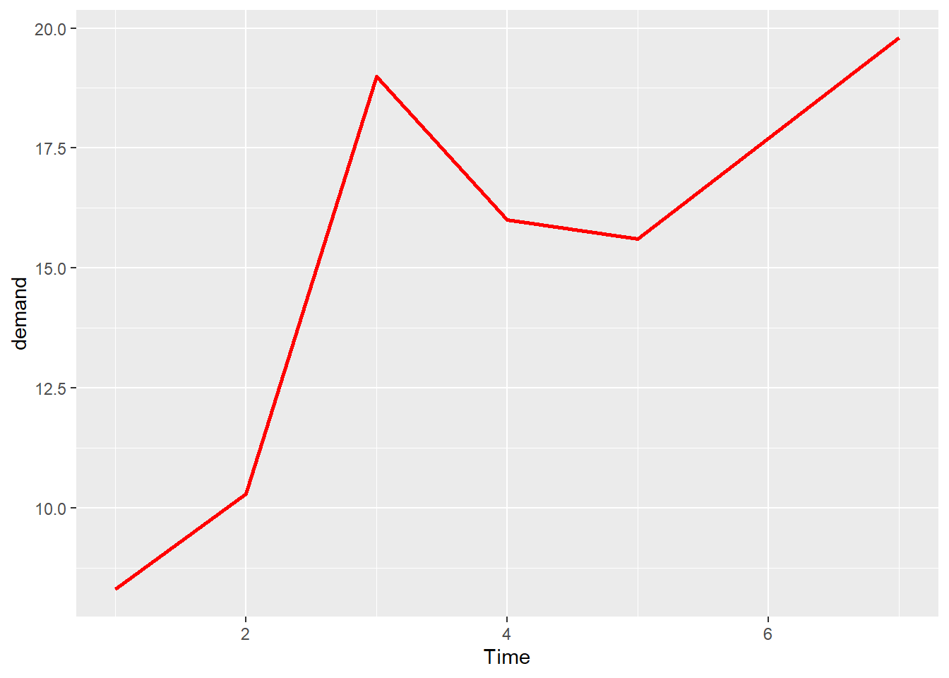
#lty is linetypeCombination of line and point:
ggplot(BOD,
       aes(x=Time, y=demand)) +
  geom_line(linetype =1, size = 1,
colour = "red") +
geom_point(pch = 21, col="blue",
bg = "lightblue",
size = 3) +
theme_light() +
scale_x_continuous(breaks = seq(1,7, by=1))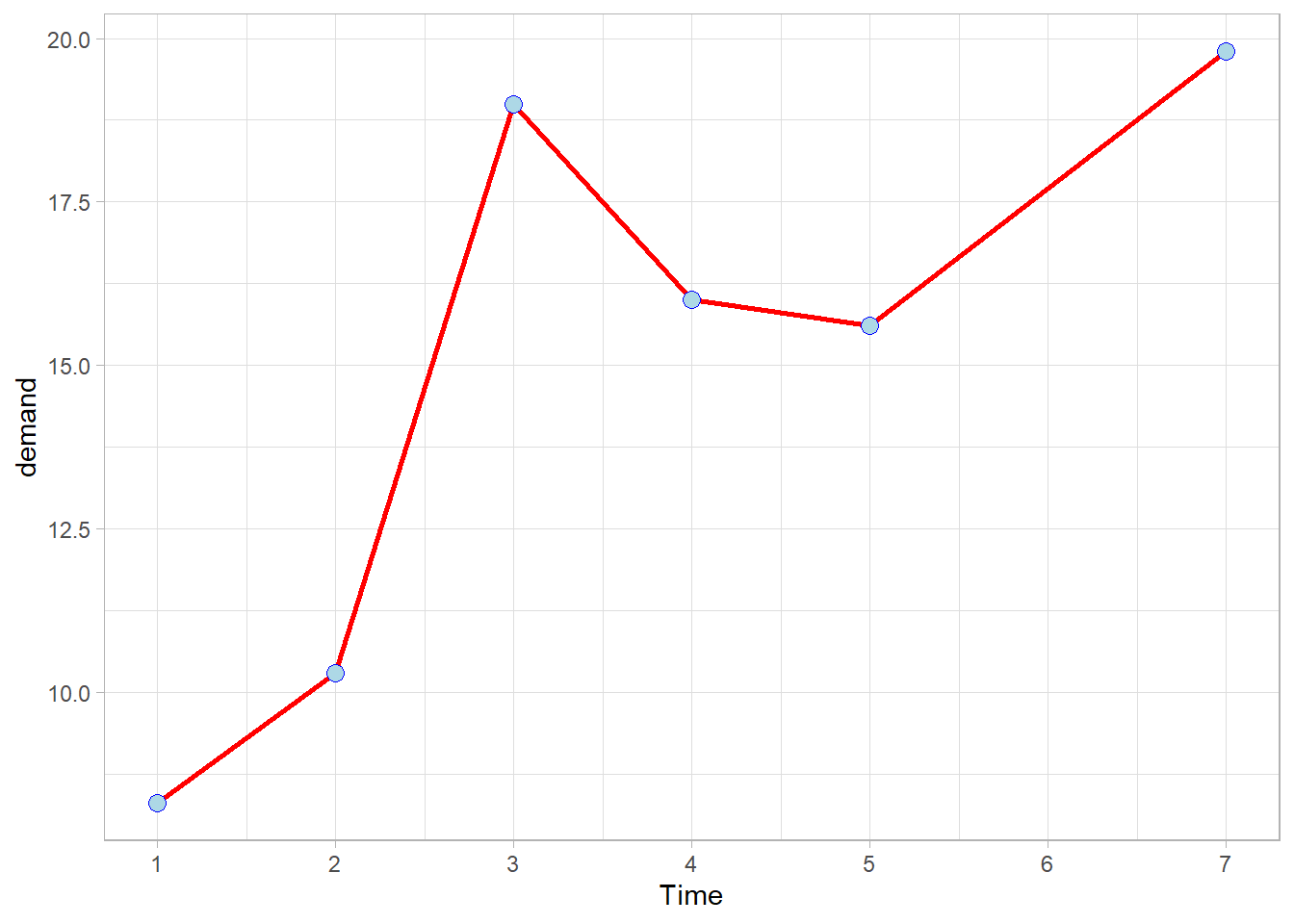
Let’s try real dataset: (Covid 19 dataset from Ministry of Health, Malaysia.
data1 <- read.csv("https://raw.githubusercontent.com/MoH-Malaysia/covid19-public/main/epidemic/cases_malaysia.csv")
names(data1)
[1] "date" "cases_new"
[3] "cases_import" "cases_recovered"
[5] "cases_active" "cases_cluster"
[7] "cases_unvax" "cases_pvax"
[9] "cases_fvax" "cases_boost"
[11] "cases_child" "cases_adolescent"
[13] "cases_adult" "cases_elderly"
[15] "cases_0_4" "cases_5_11"
[17] "cases_12_17" "cases_18_29"
[19] "cases_30_39" "cases_40_49"
[21] "cases_50_59" "cases_60_69"
[23] "cases_70_79" "cases_80"
[25] "cluster_import" "cluster_religious"
[27] "cluster_community" "cluster_highRisk"
[29] "cluster_education" "cluster_detentionCentre"
[31] "cluster_workplace" data1$date <- as.Date.factor(data1$date)
#produce whole picture
ggplot(data1,
aes(x=date, y=cases_new)) +
geom_line()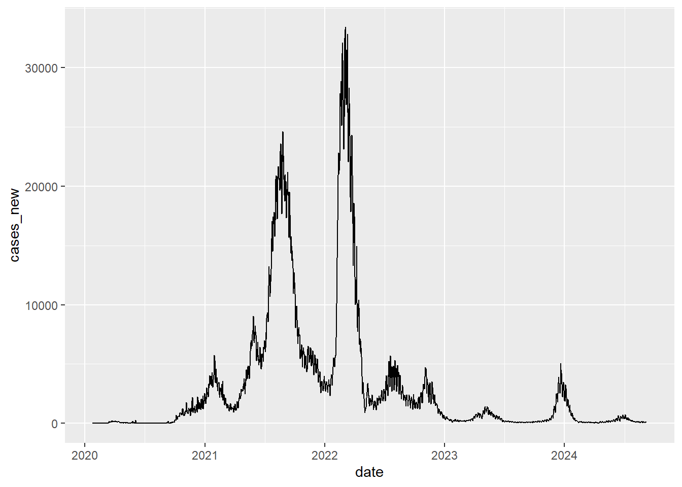
Let say I want to focus on August 2024 .
library(dplyr)

data1 %>%
  filter(date>="2024-08-01", date<="2024-08-31") %>%
  ggplot(aes(x=date, y=cases_new)) +
  geom_bar(stat="identity", width=0.3,
           fill = "#A7AFB0") +
  geom_line(lty=1, size = 1, colour="#E74EF3")+
  geom_point(pch = 21, col = "#8307F7",
             bg = "#D2ABF7", size = 4) +
  #theme_light() +
  theme(axis.text = element_text(angle=90,
                                 size = 8),
        panel.background = element_rect(fill = "white"),
        plot.background = element_blank()) +
  scale_x_continuous(breaks=data1$date) +
  geom_smooth(method = lm, se=F,
              lty=1, size = 0.5,
              col= "black")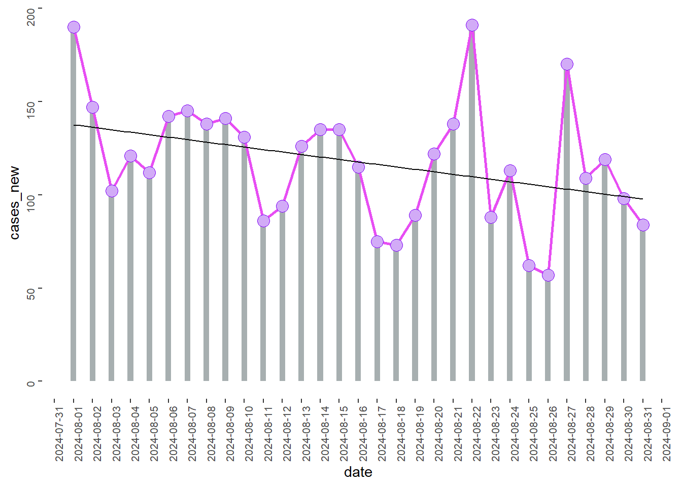
Scatter Diagram
A scatter plot, also known as a scatter diagram or scatter chart, is a way to display data using a set of points, each of which represents a pair of values for two different variables. The position of each point on the x-axis represents the value of the first variable, and the position of each point on the y-axis represents the value of the second variable. Scatter plots are useful for showing the relationship between two variables, and can help to identify patterns or trends in the data.
The scatter plot is a two-dimensional chart, in which the position of each point on the x-axis and y-axis represents the values of two variables. Each point in the scatter plot represents a single observation, and the position of the point represents the values of two variables. The scatter plot can be used to show the relationship between two variables, such as the relationship between height and weight, age and income, or temperature and precipitation.
Scatter plots can be further enhanced with additional information, such as color, size or shape of the points, to represent additional variables or to group the data into different categories. Scatter plot can also be used to detect outliers and clusters.
It’s worth noting that there are several variations of scatter plot, such as 3D scatter plot, bubble chart, etc.
#x axis should be numerical & y axis should be numerical

library(gcookbook)
str(heightweight)
'data.frame': 236 obs. of 5 variables:
$ sex : Factor w/ 2 levels "f","m": 1 1 1 1 1 1 1 1 1 1 ...
$ ageYear : num 11.9 12.9 12.8 13.4 15.9 ...
$ ageMonth: int 143 155 153 161 191 171 185 142 160 140 ...
$ heightIn: num 56.3 62.3 63.3 59 62.5 62.5 59 56.5 62 53.8 ...
$ weightLb: num 85 105 108 92 112 ...#we want to see the relationship between heightIn and weightlb
newdata <- heightweight[c(4,5)]
ggplot(newdata, aes(x=weightLb, y=heightIn)) +
geom_point()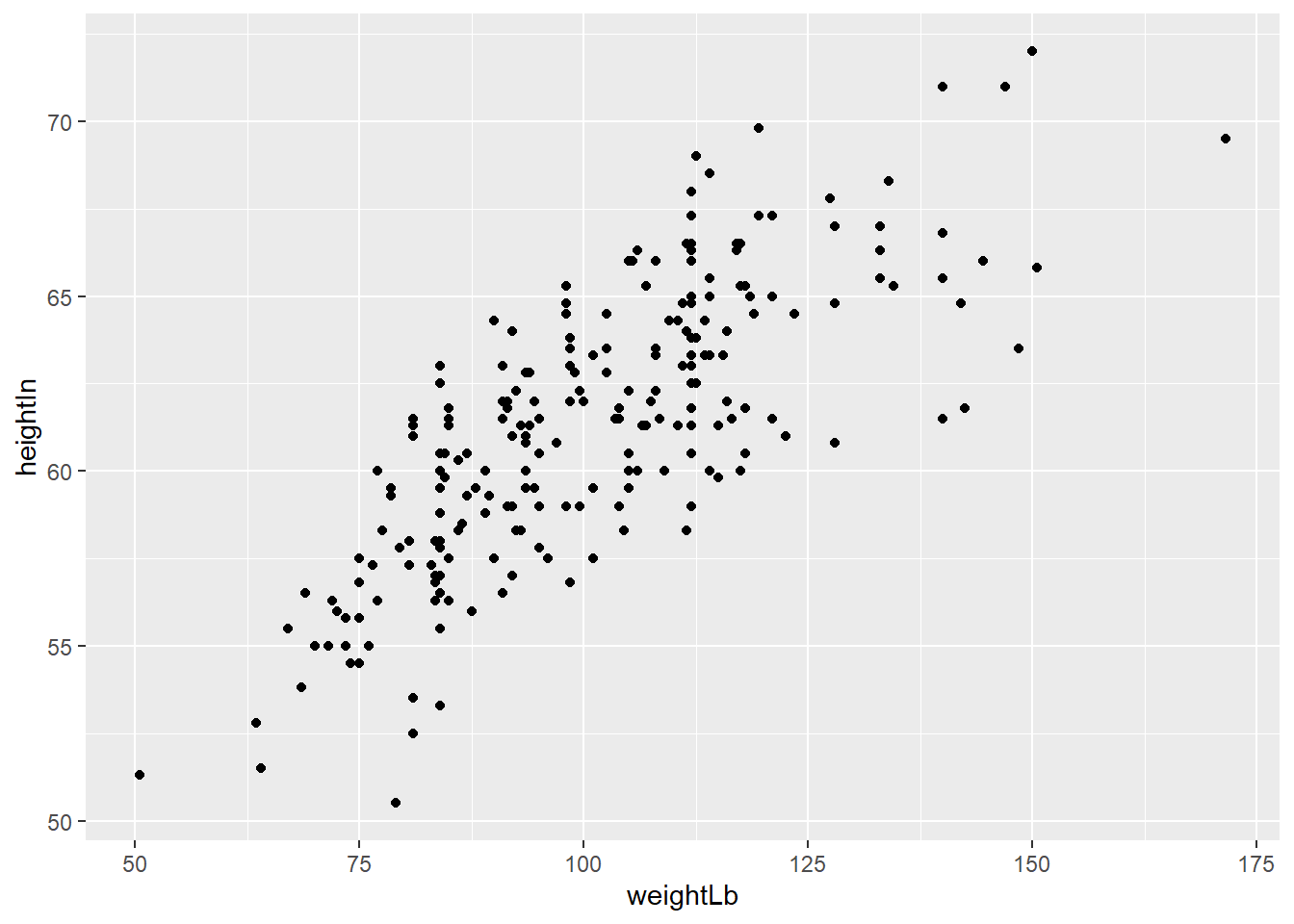
pch and shape are same:
#pch and shape are same
ggplot(heightweight, aes(x=ageYear, y=heightIn)) +
  geom_point(size=1.4, shape=21)
ggplot(heightweight, aes(x=ageYear, y=heightIn)) +
  geom_point(size=1.4, pch=22)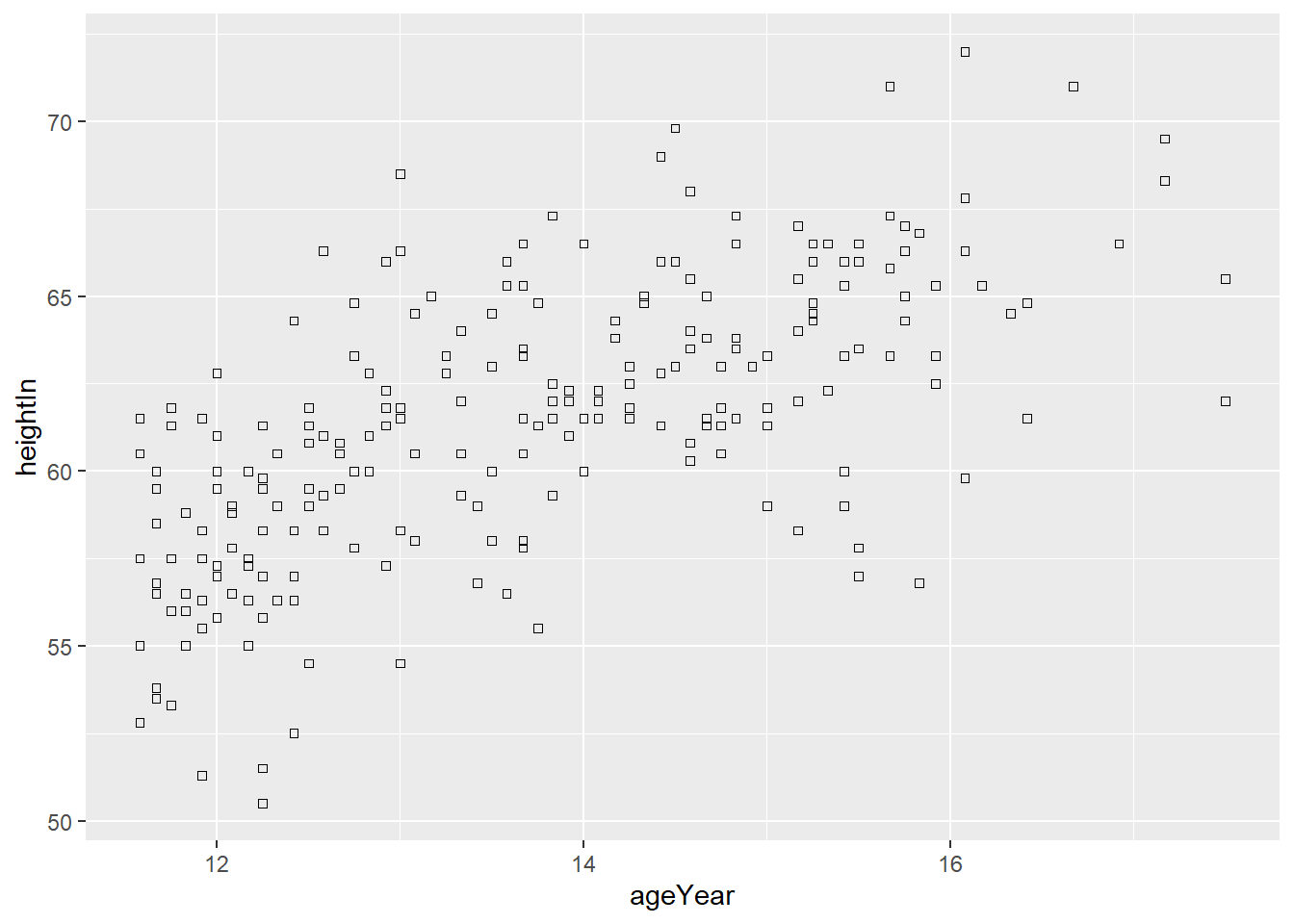
compare by group:
#option1
ggplot(heightweight, aes(x=ageYear, y=heightIn,
                         colour=sex, shape=sex)) +
geom_point(size=2) 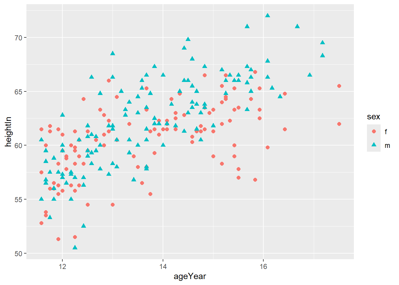
#option2
ggplot(mtcars, aes(x=wt, y=mpg,
                   colour=factor(cyl)), shape= factor(cyl)) +
         geom_point(size=3)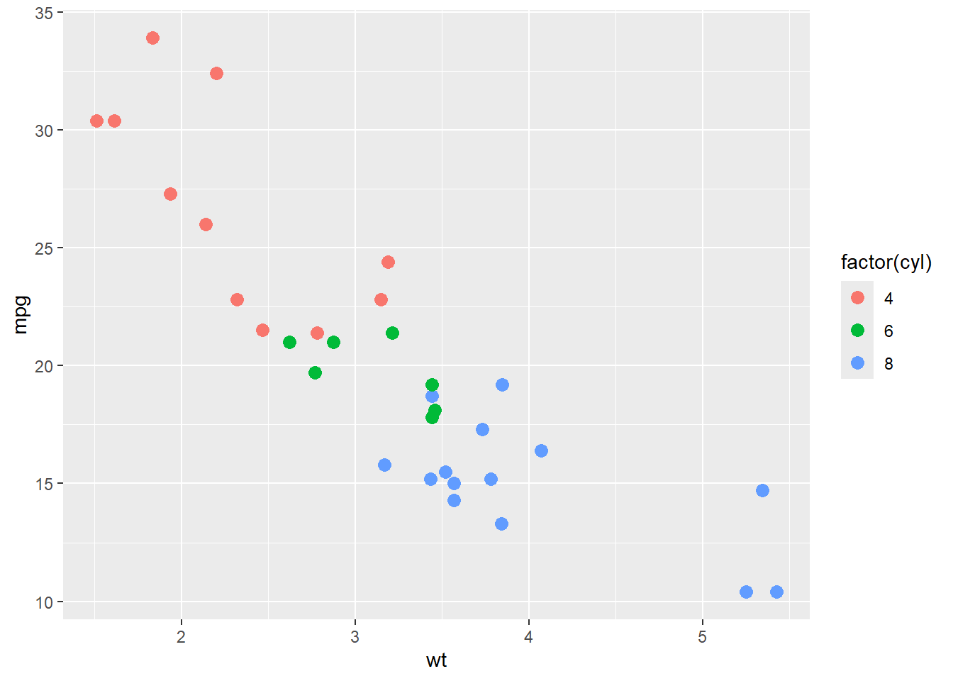
add line in graph:
#option3 # add line in graph same as abline
ggplot(mtcars) +
  geom_point(aes(x = wt, y = mpg, colour = as.factor(cyl)),
             size=3)  +
  geom_hline(yintercept = 20, color="red", size=1, lty=2) + #add line h
  geom_vline(xintercept = 3, color="blue", lwd=1, lty=2,) #add line v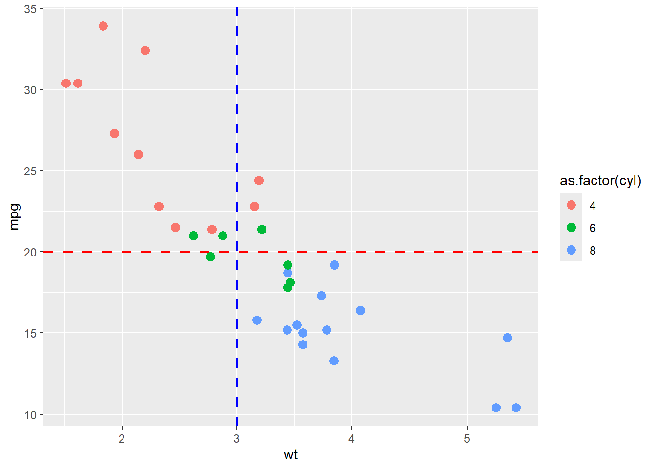
#option 4
#add linear regression line
lm(mtcars$mpg~mtcars$wt) #linear regression
Call:
lm(formula = mtcars$mpg ~ mtcars$wt)

Coefficients:
(Intercept)    mtcars$wt
37.285 -5.344 ggplot(mtcars) +
geom_point(aes(x = wt, y = mpg, colour = as.factor(cyl)),
size=3) +
geom_abline(intercept = 37.285, slope = -5.344,
color="red", size=1, lty=2) +
annotate(geom = "text", x = 2.85, y = 27, label="y=37.285 - 5.344x",
size = 5, hjust=0.5)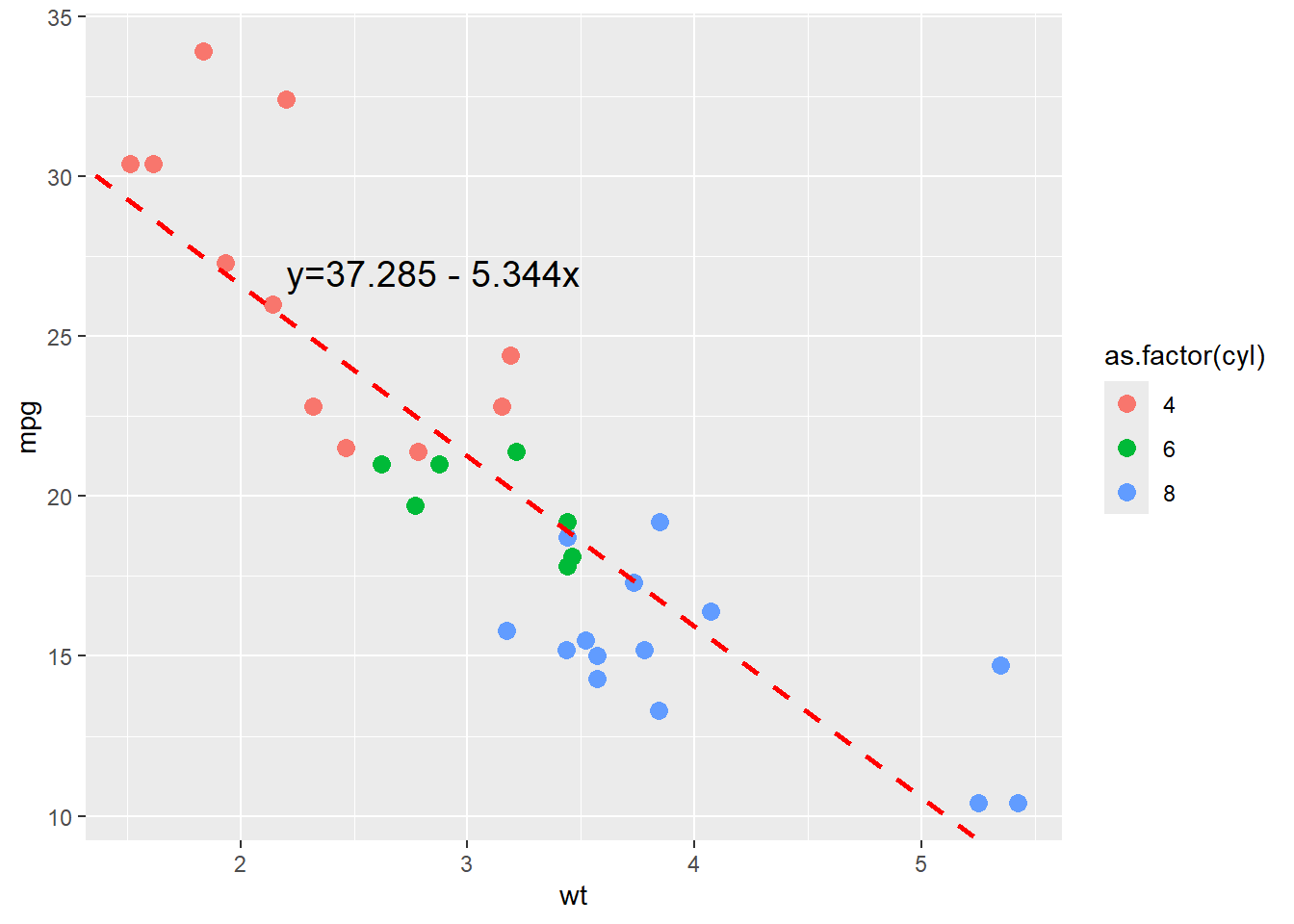
Let’s do it properly:
a<- ggplot(heightweight, aes(x=ageYear, y=heightIn)) +
  geom_point(size=4, pch=21, col = "gold", bg="lightblue") +
  ggtitle("Scatter diagram showing the relationship \n between height and age") +
  xlab("Age in Years") +
  ylab("Height in Inch")+
  scale_x_continuous(breaks = seq(10,18, by=1)) +
  scale_y_continuous(breaks = seq(50,75, by=2)) +
  theme(plot.title = element_text(family="serif", hjust=0.5,
                                  face = "plain", size= 16),
        panel.background = element_blank(), #clear all grid line
        axis.title.x = element_text(colour = "black", #x axis title
                                    size = 12,
                                    family = "serif",
                                    face="bold.italic"),
        axis.title.y = element_text(colour = "black", #y axis title
                                    size = 12,
                                    family = "serif",
                                    face="bold.italic"),
        axis.line.x = element_line(linetype = 3, # x axis line
                                   colour = "black",
                                   size=0.4),
        axis.line.y = element_line(linetype = 3, #y axis line
                                   colour = "brown",
                                   size=0.4),
        plot.background = element_rect(colour = "black") #to make plot border
        ) +
  geom_smooth(method=lm, se=F, #adding regression line
              col="brown",
              lty=3, cex=0.8)
print(a)
`geom_smooth()` using formula = 'y ~ x'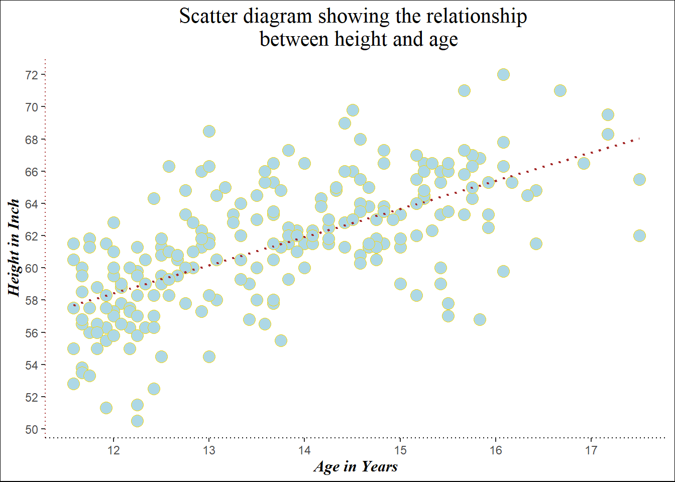
lm(heightweight$heightIn~heightweight$ageYear) #linear regression
Call:
lm(formula = heightweight$heightIn ~ heightweight$ageYear)

Coefficients:
         (Intercept)  heightweight$ageYear
              37.436                 1.748
a + annotate(geom = "text", x = 16, y = 64, label="y=37.436 + 1.748x",
size = 5, hjust=0.01,
family="serif",
col="grey36") `geom_smooth()` using formula = 'y ~ x'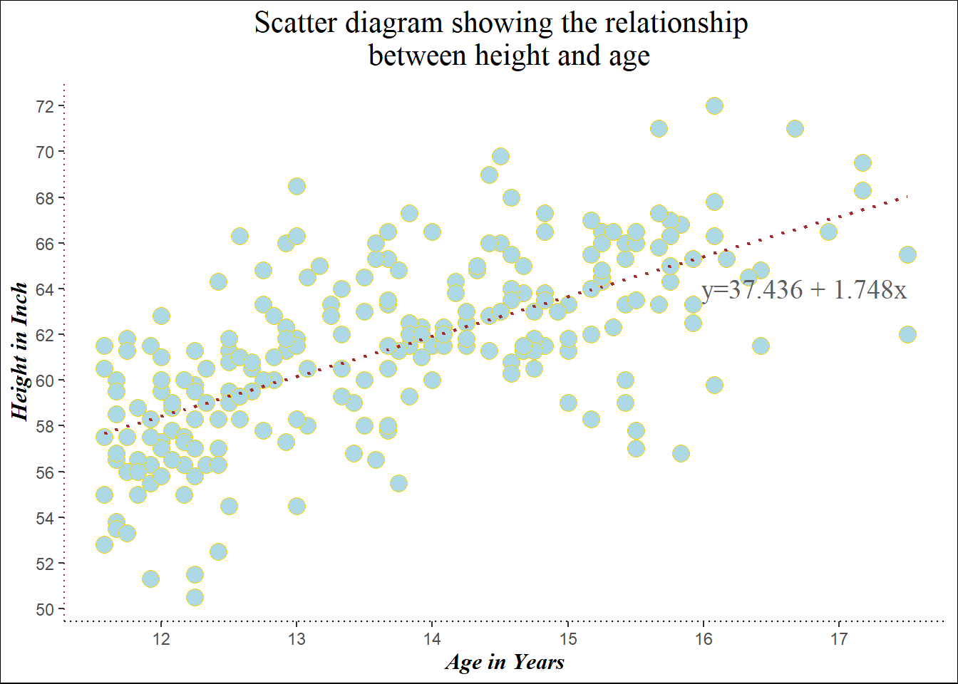
Scatter plot Matrix
A scatter plot matrix, also known as a scatter plot matrix, scatter plot diagram, scatter diagram, or scatter chart, is a way of plotting multiple scatter plots in a matrix format. It is a type of plot or graph that uses multiple scatter plots to determine the relationship between several sets of data. Each cell in the matrix is a scatter plot of two variables, and the diagonal cells are histograms or density plots of the individual variables.
A scatter plot matrix is also known as a matrix of scatter plots or simply scatter matrix. The scatter plot matrix is a grid of scatter plots where each scatter plot is presented in a cell of the grid. Each cell in the grid represents the scatter plot of two variables, such that the variables are represented by the rows and columns of the grid. The scatter plot matrix can be used to show the relationship between multiple variables, such as the relationship between height, weight, age, and income, temperature, and precipitation, etc.
Scatter plot matrix is a useful tool to identify the correlation between variables, outlier, and clusters. It is also useful for identifying the relationship between variables, such as linear, non-linear, or no relationship. Scatter plot matrix is also useful for identifying the distribution of the data and for identifying outliers.
It’s worth noting that there are several variations of scatter plot matrix such as pair-wise scatter plot matrix, 3D scatter plot matrix etc.
dim(countries)[1] 11016 7head(countries) Name Code Year GDP laborrate healthexp infmortality
1 Afghanistan AFG 1960 55.60700 NA NA NA
2 Afghanistan AFG 1961 55.66865 NA NA NA
3 Afghanistan AFG 1962 54.35964 NA NA NA
4 Afghanistan AFG 1963 73.19877 NA NA NA
5 Afghanistan AFG 1964 76.37303 NA NA NA
6 Afghanistan AFG 1965 94.09873 NA NA NAtail(countries) Name Code Year GDP laborrate healthexp infmortality
11011 Zimbabwe ZWE 2005 444.1574 68.4 NA 60.2
11012 Zimbabwe ZWE 2006 415.2822 67.9 NA 58.5
11013 Zimbabwe ZWE 2007 402.0607 67.3 NA 56.4
11014 Zimbabwe ZWE 2008 354.6548 66.3 NA 54.2
11015 Zimbabwe ZWE 2009 467.8534 66.8 NA 52.2
11016 Zimbabwe ZWE 2010 594.5215 NA NA 50.9#to select data for year 2009 only
c2009 <- subset(countries, Year==2009,
select= c(Name, GDP, laborrate, healthexp, infmortality))
#to see the correlation between numerical variables
cor(na.omit(c2009[2:5])) GDP laborrate healthexp infmortality
GDP 1.0000000 -0.1210241 0.9373149 -0.5153807
laborrate -0.1210241 1.0000000 -0.1408531 0.4366607
healthexp 0.9373149 -0.1408531 1.0000000 -0.4726413
infmortality -0.5153807 0.4366607 -0.4726413 1.0000000pairs(c2009[,2:5])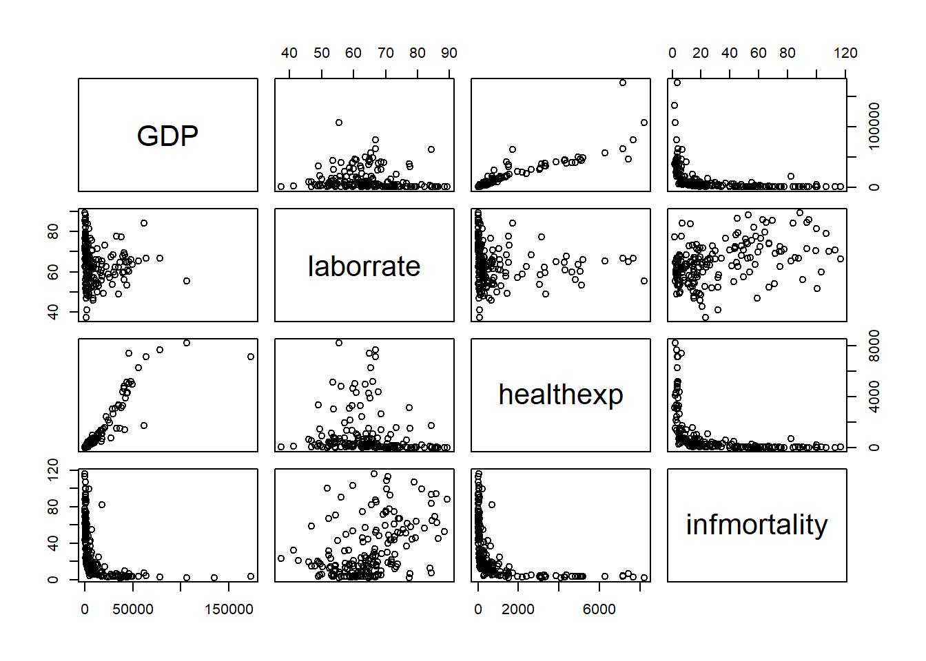
Histogram
A histogram is a graphical representation of the distribution of a dataset. It is an estimate of the probability distribution of a continuous variable. It is a way to display data by dividing the entire range of values into a series of bins, and then plotting the number of data points that fall into each bin. The bins are represented by rectangles, with the height of each rectangle proportional to the number of data points in the corresponding bin. The x-axis represents the variable being measured, with the bins on the x-axis representing the range of values for that variable, and the y-axis represents the frequency of occurrences of the variable in that bin.
A histogram is a graphical representation of the distribution of a dataset, showing the frequency of the different values that occur in the dataset. The bins are the range of values that are grouped together and the height of each bar represents the number of observations that fall within that bin. Histograms are useful for visualizing the distribution of a variable, identifying outliers, and detecting skewness, bimodality, and other features of the distribution.
It’s worth noting that there are several variations of histograms such as stacked histogram, kernel density plot, etc.
Let say we want to see the shape of the data distribution only for single continuous variable:
str(faithful)'data.frame': 272 obs. of 2 variables:
$ eruptions: num 3.6 1.8 3.33 2.28 4.53 ...
$ waiting : num 79 54 74 62 85 55 88 85 51 85 ...binsize = diff(range(faithful$waiting))/15
ggplot(faithful, aes(x=waiting)) +
geom_histogram(binwidth = binsize,
fill="lightblue", colour="black")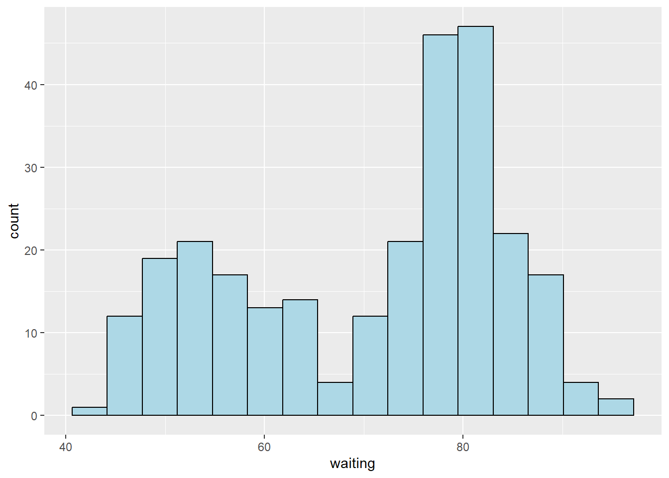
Histogram from grouped data:
library(MASS) #for dataset birthwt
head(birthwt)
low age lwt race smoke ptl ht ui ftv bwt
85 0 19 182 2 0 0 0 1 0 2523
86 0 33 155 3 0 0 0 0 3 2551
87 0 20 105 1 1 0 0 0 1 2557
88 0 21 108 1 1 0 0 1 2 2594
89 0 18 107 1 1 0 0 1 0 2600
91 0 21 124 3 0 0 0 0 0 2622#we use smoke as the grouped variable
ggplot(birthwt, aes(x=bwt)) +
geom_histogram(fill="white", colour="black") +
facet_grid(smoke ~. )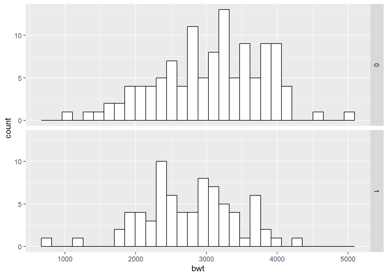
Histogram with normal curve:
ggplot(birthwt, aes(x = bwt)) +
  geom_histogram(aes(y = ..density.., fill=..count..)) +
  stat_function(fun = dnorm, color = "red",
                args = list(mean = mean(birthwt$bwt, na.rm = TRUE),
                            sd = sd(birthwt$bwt, na.rm = TRUE)))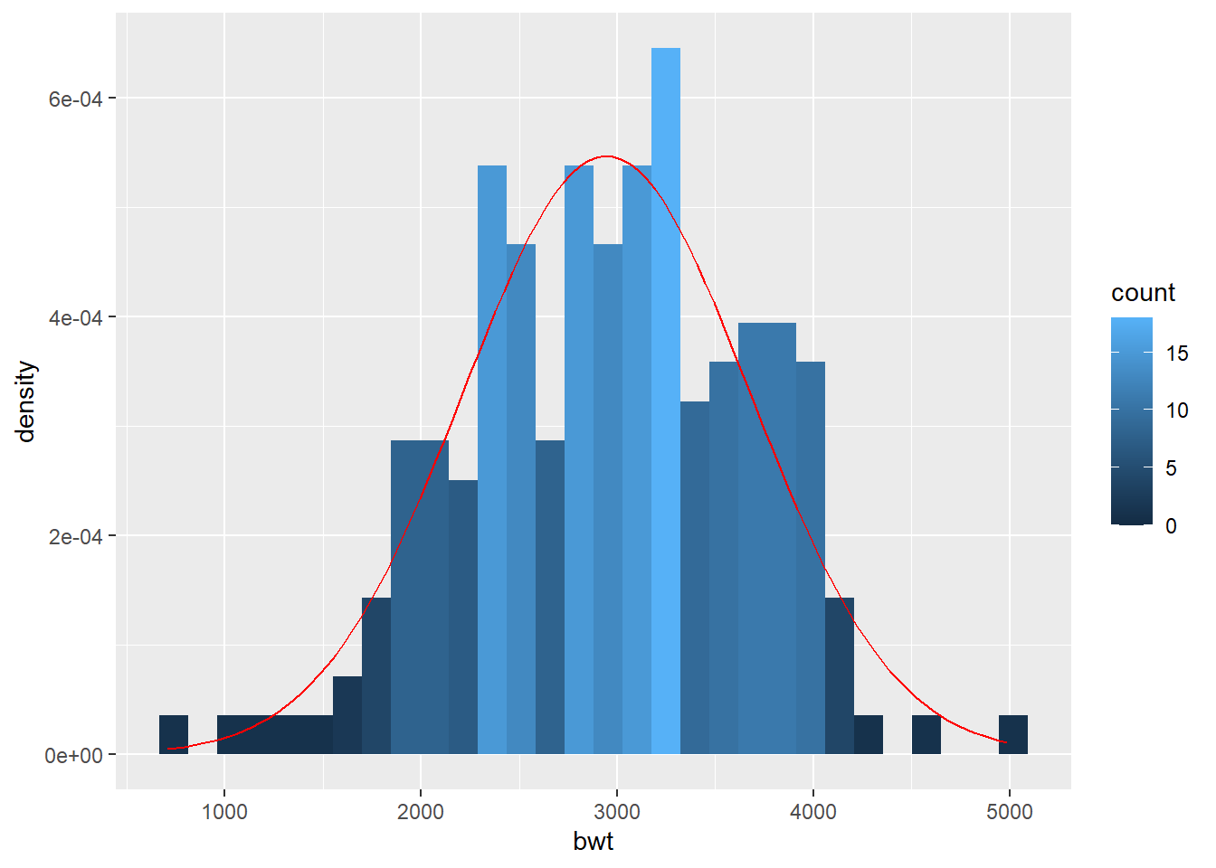
Boxplot
A box plot, also known as a box-and-whisker plot, is a graphical representation of the distribution of a dataset. It provides a way to display the five-number summary of a set of data: the minimum, first quartile (Q1), median, third quartile (Q3), and maximum. The box plot can also show outliers and other features of the distribution.
A box plot consists of a rectangle, called the box, which spans the first quartile to the third quartile (the interquartile range or IQR), a vertical line inside the box (whisker) which shows the median, and an “X” or “+” symbol which represents the mean.
The box plot also includes “whiskers”, which are lines extending from the box to the minimum and maximum values of the data, or to the most extreme data points that are not considered outliers. Outliers are plotted as individual points outside the whiskers.
Box plots are useful for visualizing the distribution of a variable, identifying outliers, and comparing the distribution of multiple datasets. It allows the viewer to quickly get a sense of the range, center and skewness of the data. It is particularly useful for comparing distributions across multiple groups, as it shows the range, median and quartile information of each group in a concise way.
ggplot(birthwt, aes(y=bwt)) + geom_boxplot()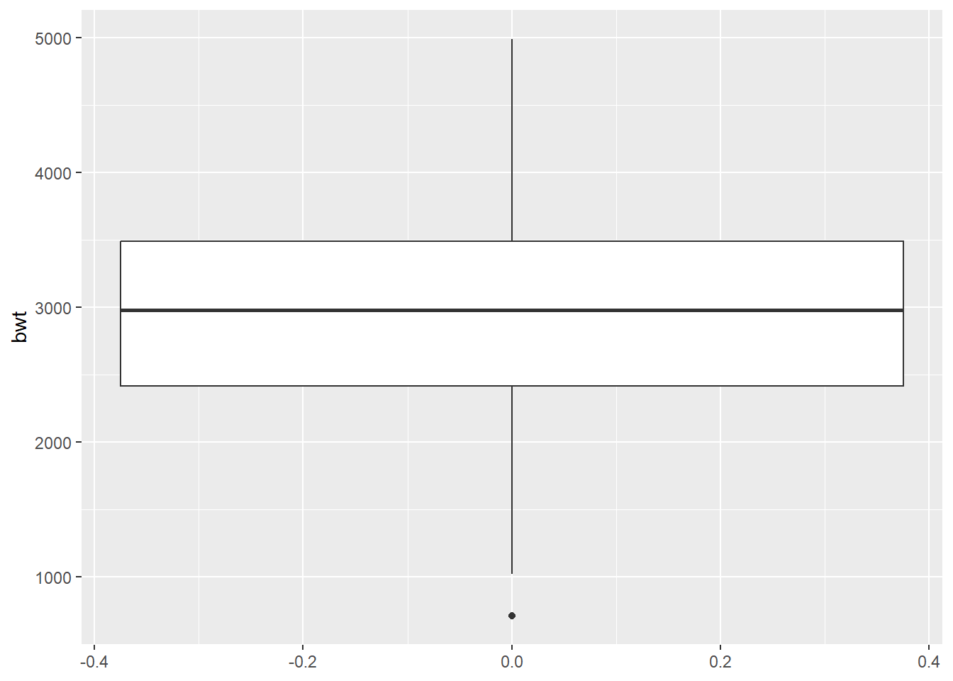
Let say we want to create boxplot compare with group:
library(ggthemes)
 ggplot(birthwt, aes(x=as.factor(smoke) , y=bwt)) +
   geom_boxplot()  +
   theme_clean()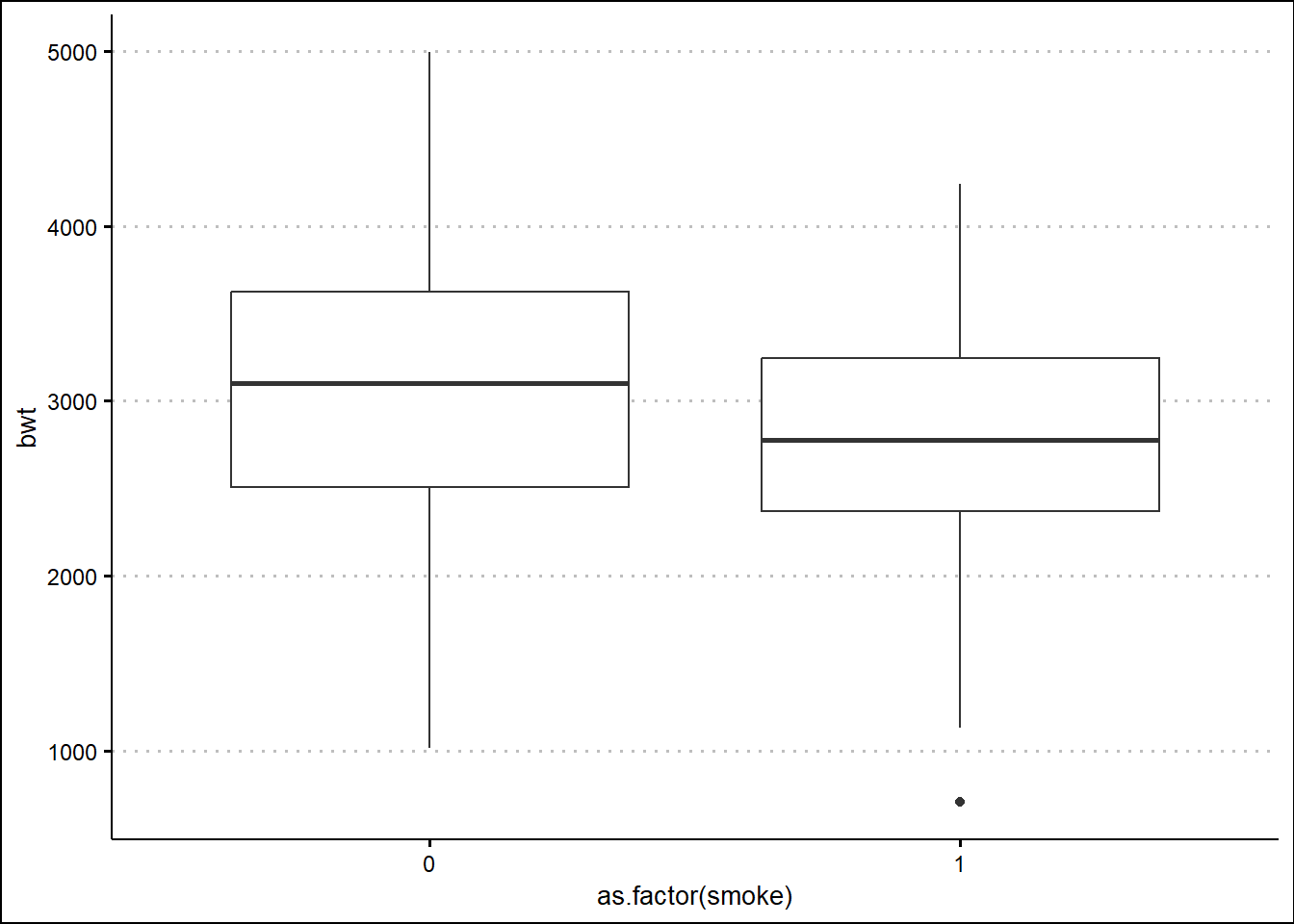
Boxplot with jitter:
library(ggthemes)
 ggplot(birthwt, aes(x=as.factor(smoke) , y=bwt)) +
   geom_boxplot() + geom_jitter() +
   theme_clean()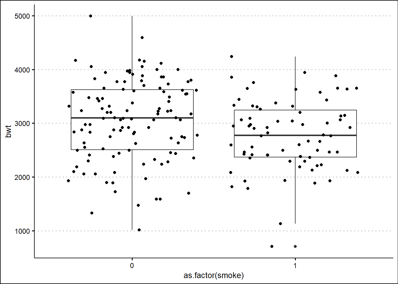
Let’s try with real dataset from global crop yield across multiple years directly from TidyTuesday github page:
key_crop_yields <- readr::read_csv('https://raw.githubusercontent.com/rfordatascience/tidytuesday/master/data/2020/2020-09-01/key_crop_yields.csv')
 countries <- c("China", "Taiwan", "Philippines",
                "India","Bangladesh", "Malaysia",
                "Mexico", "United States")

 key_crop_yields %>%
   filter(Entity %in% countries) %>%
   ggplot(aes(Entity,`Rice (tonnes per hectare)`)) +
   geom_boxplot() +
   geom_jitter(width=0.15)+
   ggtitle("Boxplot showing distribution of Rice by Entity") +
   xlab("Entity") +
   ylab("Rice in tonnes/hectare") +
 #  theme_light()+
   theme(axis.text.x = element_text(angle = 90, hjust=0.5,
                                    colour = "#471706"),
         axis.text.y = element_text(colour = "#110101"),
         plot.title = element_text(hjust=0.5,
                                   family= "serif", face="plain",
                                   size = 16),
         axis.title.x = element_text(colour = "#110101", size = 12),
         axis.title.y = element_text(colour = "#110101", size = 12),
         panel.background = element_blank(),
         axis.line.x = element_line(colour = "#110101",
                                    linetype = 2,
                                    size = 0.5),
         panel.grid.major.y = element_line(color = "grey71",
                                           linetype = 3,
                                            size = 0.01),
         axis.ticks.x = element_blank(),
         axis.ticks.y = element_blank()) +
scale_y_continuous(breaks = seq(0,10,by=1)) 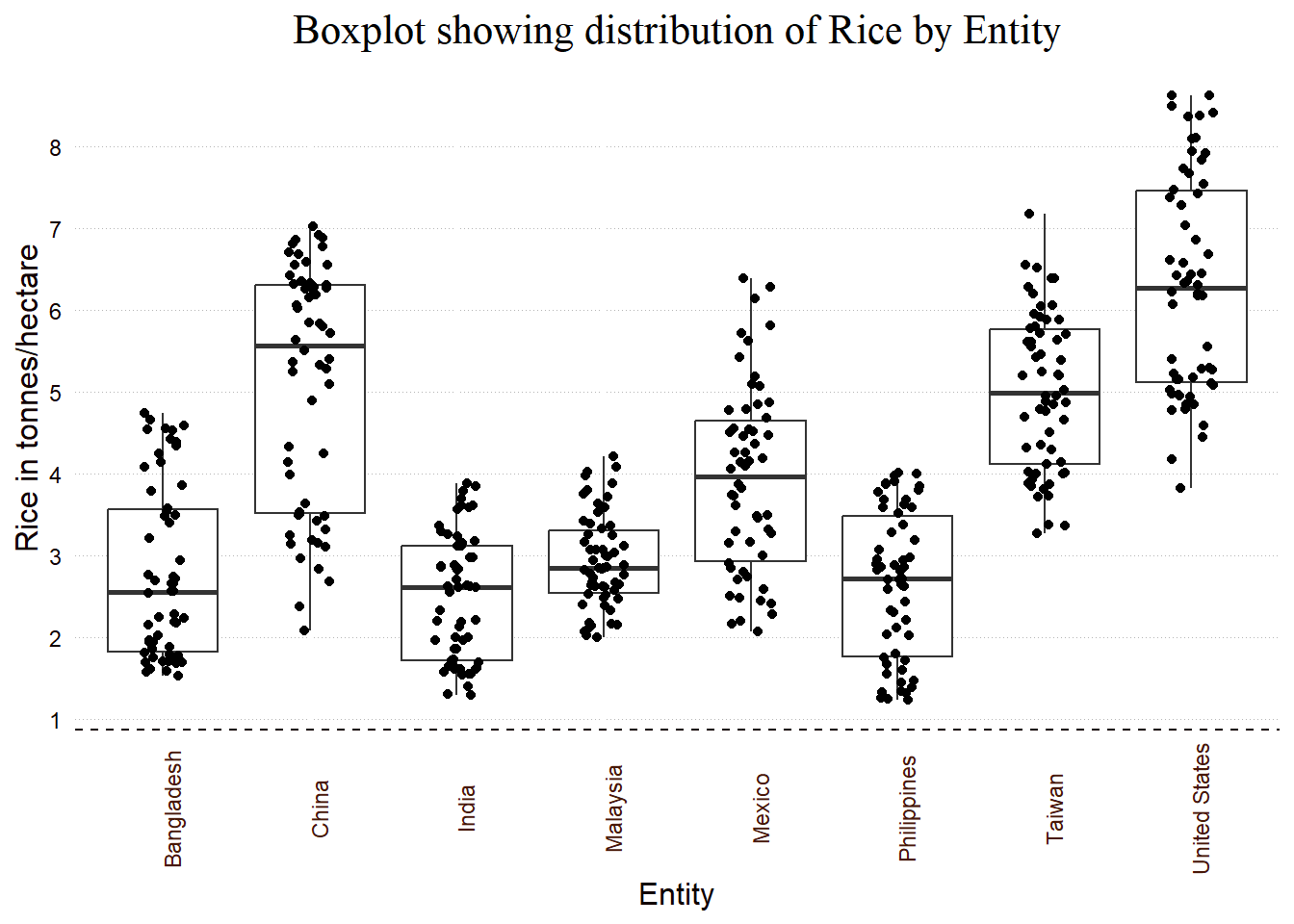
Look at another example:
library(ggthemes)
key_crop_yields %>%
   filter(Entity %in% countries) %>%
   ggplot(aes(Entity,`Rice (tonnes per hectare)`,
                #colour=Entity,
              fill=Entity)) + #to fill in with colours
   #colour is for border only,
   #fill is to fill in the boxplot
   geom_boxplot() +
   geom_jitter(width=0.50, colour="#B3B4B4", size=1)+
   ggtitle("Boxplot showing distribution of Rice by Entity") +
   xlab("Entity") +
   ylab("Rice in tonnes/hectare") +
   #  theme_light()+
   theme(axis.text.x = element_text(angle = 90, hjust=0.5,
                                    colour = "#471706"),
         axis.text.y = element_text(colour = "#110101"),
         plot.title = element_text(hjust=0.5,
                                   family= "serif", face="plain",
                                   size = 16),
         axis.title.x = element_text(colour = "#110101", size = 12),
         axis.title.y = element_text(colour = "#110101", size = 12),
         panel.background = element_blank(),
         axis.line.x = element_line(colour = "#110101",
                                    linetype = 2,
                                    size = 0.5),
         panel.grid.major.y = element_line(color = "grey71",
                                           linetype = 3,
                                           size = 0.01),
         axis.ticks.x = element_blank(),
         axis.ticks.y = element_blank(),
         legend.title =  element_blank(),
         legend.position = "none") +
   scale_y_continuous(breaks = seq(0,10,by=1)) +
   scale_fill_tableau(palette = "Classic 10 Light") +
   scale_color_tableau()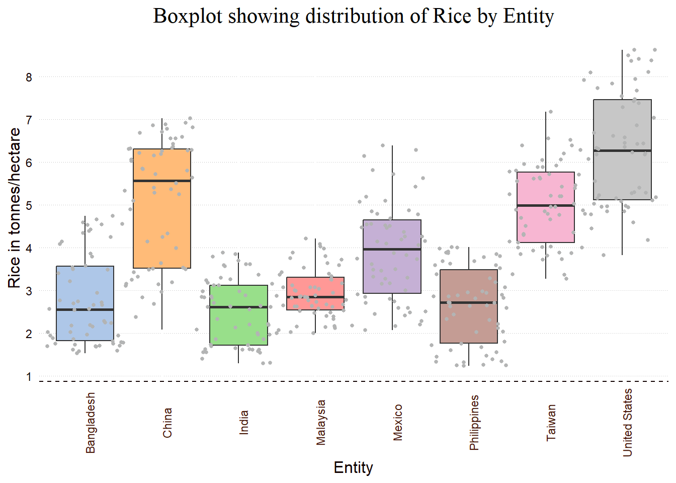
Notice that I am using new function “scale_color_tableau()” from ggthemes package to use the colour tamplate.
scale_color_*() functions in the ggthemes package are an extension of the scale_color_*() functions in the ggplot2 package, which allow you to set the color scale for a plot. The ggthemes package provides additional color schemes for ggplot2 plots. These functions are similar to the scale_fill_*() functions in ggplot2 and are used to set the color of different elements in a plot, such as lines, points, or bars.
Some commonly used scale_color_*() functions from ggthemes package include:
scale_color_economist(): uses the color scheme from The Economist magazinescale_color_5thcolor(): uses a five-color palettescale_color_tableau(): uses Tableau’s default color palettescale_color_claret(): uses a color scheme of dark and muted colorsscale_color_hue(): maps the color to a continuous variable using a specified color mapscale_color_tableau10(): uses Tableau’s 10-color palettescale_color_jco(): uses the color scheme from the Journal of Computationalscale_color_stata(): uses the color scheme from Stata.
Please note that the ggthemes package is not a built-in package of R, and you will have to install it first before using these functions.
To rotate the boxplot, we can use “coord_flip()” function:
key_crop_yields %>%
   filter(Entity %in% countries) %>%
   ggplot(aes(Entity,`Rice (tonnes per hectare)`,
              #colour=Entity,
              fill=Entity)) + #to fill in with colours
   #colour is for border only,
   #fill is to fill in the boxplot
   geom_boxplot() +
   geom_jitter(width=0.50, colour="#B3B4B4", size=1)+
   ggtitle("Boxplot showing distribution of Rice by Entity") +
   xlab("Entity") +
   ylab("Rice in tonnes/hectare") +
   #  theme_light()+
   theme(axis.text.x = element_text(angle = 0, hjust=0.5,
                                    colour = "#471706"),
         axis.text.y = element_text(colour = "#110101"),
         plot.title = element_text(hjust=0.5,
                                   family= "serif", face="plain",
                                   size = 16),
         axis.title.x = element_text(colour = "#110101", size = 12),
         axis.title.y = element_text(colour = "#110101", size = 12),
         panel.background = element_blank(),
         axis.line.x = element_line(colour = "#110101",
                                    linetype = 2,
                                    size = 0.5),
         panel.grid.major.y = element_line(color = "grey71",
                                           linetype = 3,
                                           size = 0.01),
         axis.ticks.x = element_blank(),
         axis.ticks.y = element_blank(),
         legend.title =  element_blank(),
         legend.position = "none") +
   scale_y_continuous(breaks = seq(0,10,by=1)) +
   scale_fill_tableau(palette = "Classic 10 Light") +
   scale_color_tableau() +
   coord_flip()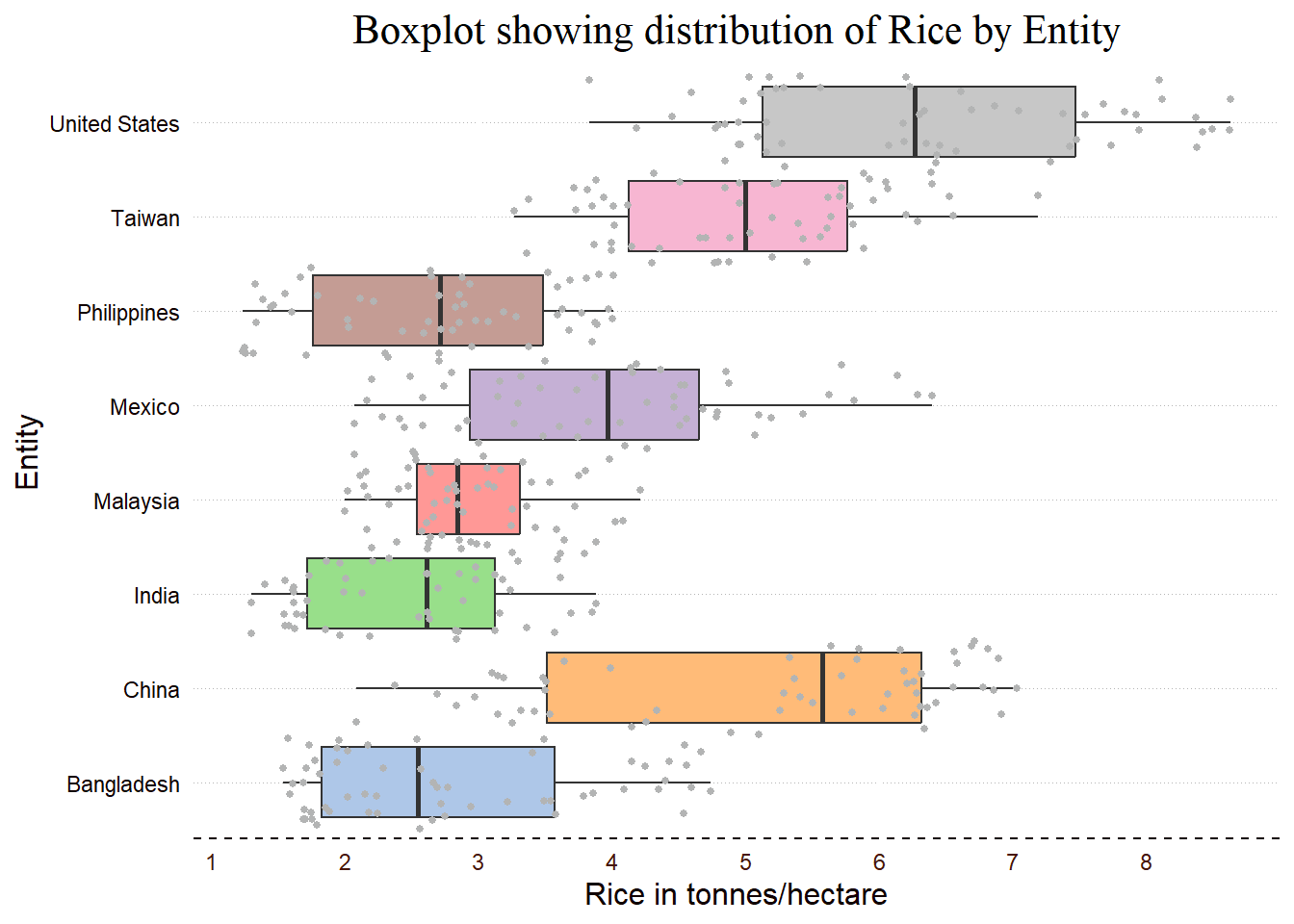
Hope you got some knowledge on how to conduct a graph using ggplot2 package. For your information, this note only touch some basic functionality of ggplot2 package. There are a lot more to explore such as faceting, axis, annotating, etc.
Thank you,
Dr. Mohammad Nasir Abdullah
PhD (Statistics), MSc (Medical Statistics), BSc(hons)(Statistics), Diploma in Statistics,
Graduate Statistician, Royal Statistical Society.
Senior Lecturer,
Mathematical Sciences Studies,
College of Computing, Informatics and Mathematics,
Universiti Teknologi MARA,
Tapah Campus, Malaysia.
References
Gómez-Rubio, Virgilio. 2017. “Ggplot2 - Elegant Graphics for Data Analysis (2nd Edition).” Journal of Statistical Software 77 (Book Review 2). https://doi.org/10.18637/jss.v077.b02.