data(mtcars)

plot(mtcars$wt, mtcars$mpg) #ploting scatter diagram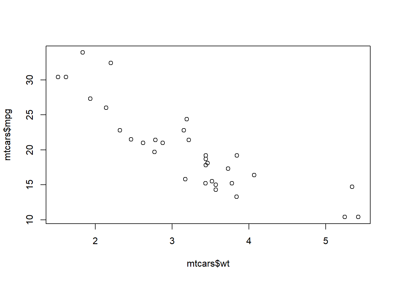
Data visualisation is the graphical presentation of information and data. It is the combination of the elements like charts, graphs, and maps. The data visualisation is another form of visual art that grabs our interest and keeps our eyes on the message. When we see a chart, we can easily see trends and outliers of the dataset.
The tools for data visualisation provide an accessible way to see and understand trends, outliers and patterns in dataset. For the world of big data and IR4.0; data visualisation tools and technologies are essential to analyse massive amounts of information and make data-driven decisions.
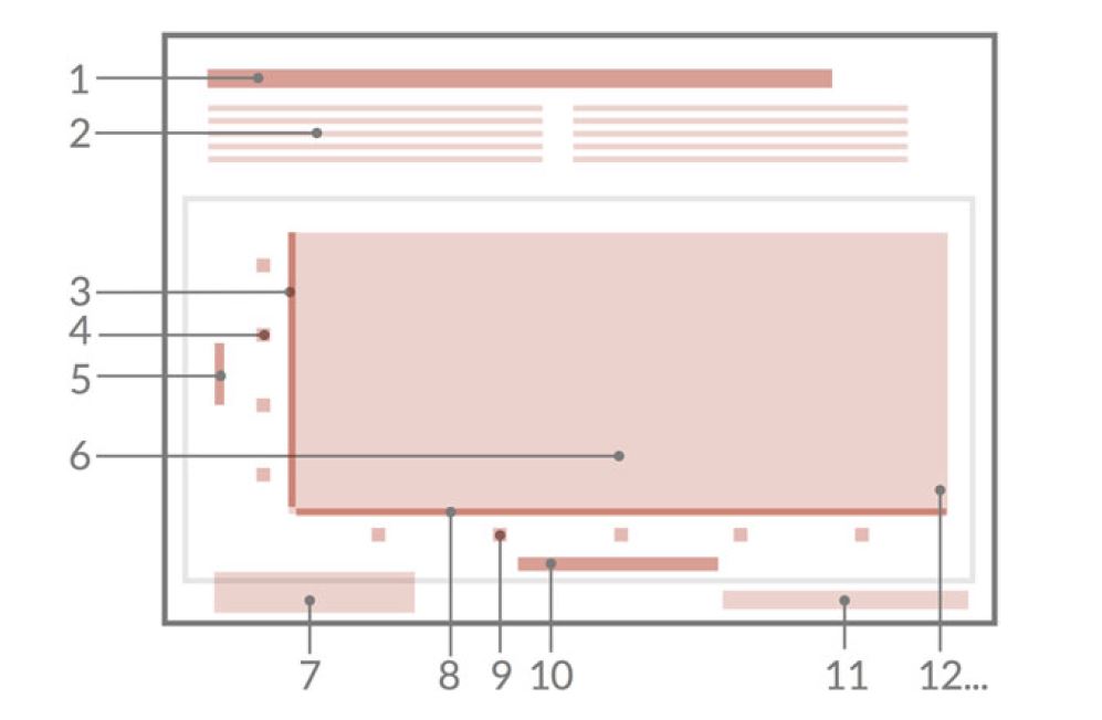
Before we address the actual implementation of graphics in R, we will need to understand the structure of figures. There are two elements in the data visualisations:
The styling pattern is based on the term used in graphic design; where ancillary elements is for the used typefaces and symbols as well as colour.
A figure can be one or more charts or graphs. A chart consists of a data area and optional axes, axis labels, axis names, point names, legends, headings and captions. A figure can contain several charts. Every individual chart can have headings and captions, axes, legends and etc.. If one figure contains several charts, then this is called as a panel.
A figure comprises :
1) Title
2) a subtitle
3) y-axis
4) y-tick labels
5) y-axis title
6) data area
7) legend
8) x-axis
9) x-tick labels
10) x-axis title
11) Sources
12) etc..
Figures can also contain futher elements such as annotations, lines or symbols.
In this section, we are dicussing on how to start quickly to plotting a graph. It is sometimes useful to use the plotting function in base R. These are installed by default with R and do not require any additional packages to be installed. They are quick to type and straightforward to use in simple cases, and run very quickly.
If you want to do anything beyond very simple graphs, it is generally better to switch to ggplot2
Scatter plot is suitable for quantitative variable only. It is to compare 2 quantitative variables to see relationship between 2 continuous/numerical variables.
In this example, we use mtcars dataset which are available in the R environment from dataset package. (data())
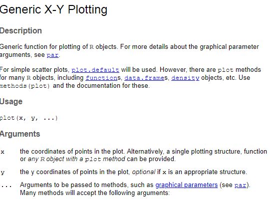
To develop a scatter diagram, we will use function name “plot”. The plot function documentation can be obtained by hit “?plot” in RStudio console.
In “plot” function, the first argument that we need to input is the variable to be in the x-axis, followed by variable to be in the y-axis. It also can be input some other argument such as type, color, pch, lty, lwd etc..
A default argument for “type” in plot function is ‘p’ which is stand for point. “l” stands for lines, “b” is for both line and point. and there are many more “type” argument can be adjusted based on our preference.
For scatter plot, we will use “plot” function with x variable and y variable inputed in the function.
data(mtcars)
plot(mtcars$wt, mtcars$mpg) #ploting scatter diagram
We can add title for the graph by adding “main” argument in the function. For x-axis title is “xlab” and for y-axis title is “ylab”
plot(mtcars$wt, mtcars$mpg,
     main="Relationship between Weight of the cars \n and Miles per gallon",
     xlab = "Weight of the cars",
     ylab = "Miles per Gallon")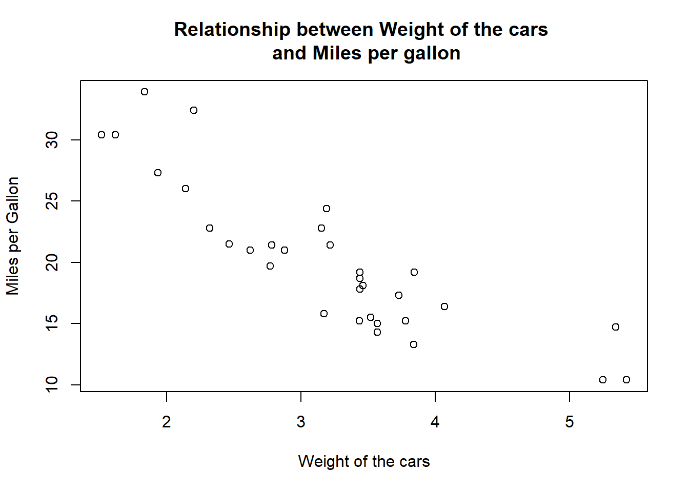
We can change the point shape for data point in the scatter plot by “pch” argument.
plot(mtcars$wt, mtcars$mpg,
     main="Relationship between Weight of the cars \n and Miles per gallon",
     xlab = "Weight of the cars",
     ylab = "Miles per Gallon",
     pch = 23) #shape of the points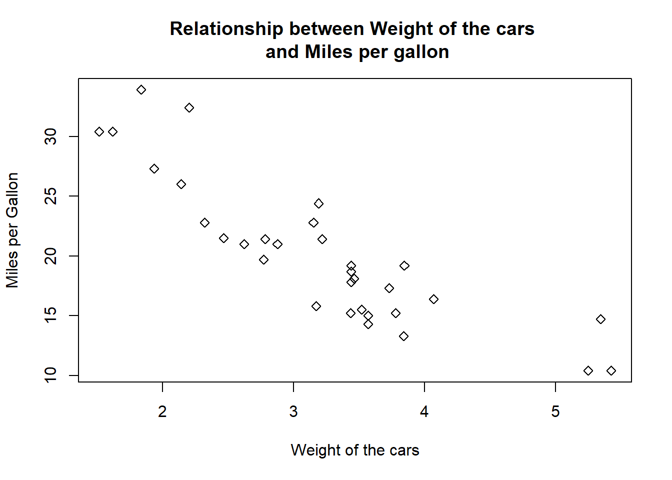
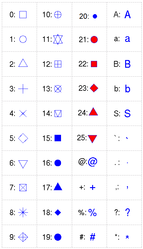
The reference for type of points shape for data points are:
We can also making the point shape ticker by inputing the argument “lwd”
plot(mtcars$wt, mtcars$mpg,
     main="Relationship between Weight of the cars \n and Miles per gallon",
     xlab = "Weight of the cars",
     ylab = "Miles per Gallon",
     pch = 23,
     lwd = 2)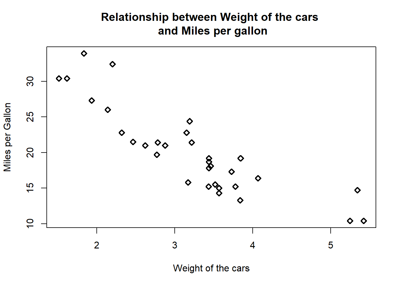
We can input some color for point shape in the scatter plot by using “col” argument.
we can see all colour availables by type “colors()”
plot(mtcars$wt, mtcars$mpg,
     main="Relationship between Weight of the cars \n and Miles per gallon",
     xlab = "Weight of the cars",
     ylab = "Miles per Gallon",
     pch = 23,
     lwd = 2,
     col = "lightpink")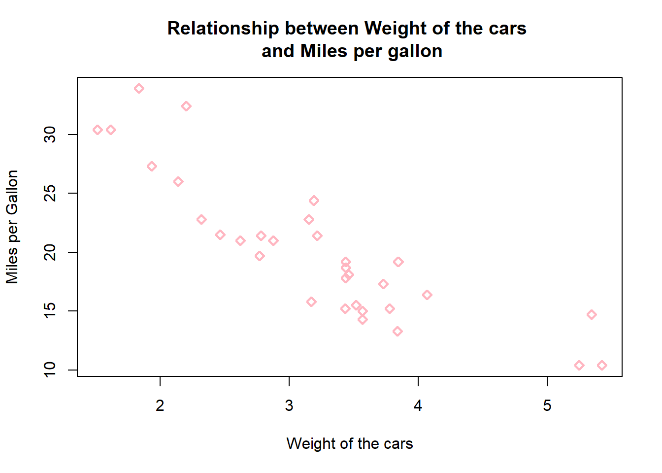
If we would like to input some specific color in the point shape we can also search the preferable colour in “htmlcolorcode” website (https://htmlcolorcodes.com) to input the prefered color. For example, orange color with code “#F7A012”.
plot(mtcars$wt, mtcars$mpg,
     main="Relationship between Weight of the cars \n and Miles per gallon",
     xlab = "Weight of the cars",
     ylab = "Miles per Gallon",
     pch = 23,
     lwd = 2,
     col = "#F7A012")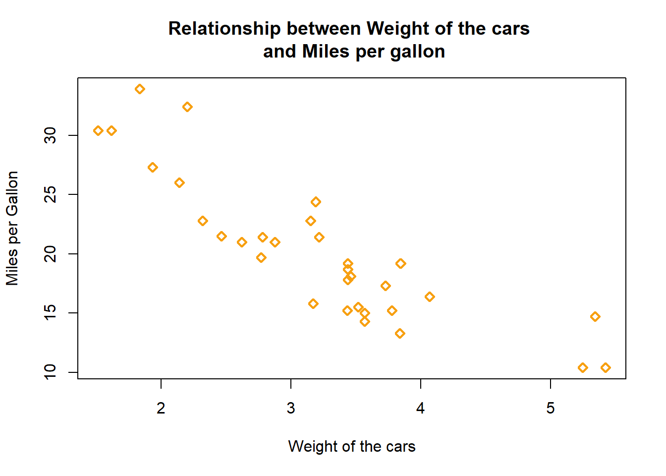
Furthermore, we can also plot the scatter diagram and differentiate the data by group using colour. For example, we want to know relationship of miles per gallon and weight of the car based on type of engine cylinder.
plot(mtcars$wt, mtcars$mpg,
     main="Relationship between Weight of the cars \n and Miles per gallon",
     xlab = "Weight of the cars",
     ylab = "Miles per Gallon",
     pch = 23,
     lwd = 2,
     col = mtcars$cyl)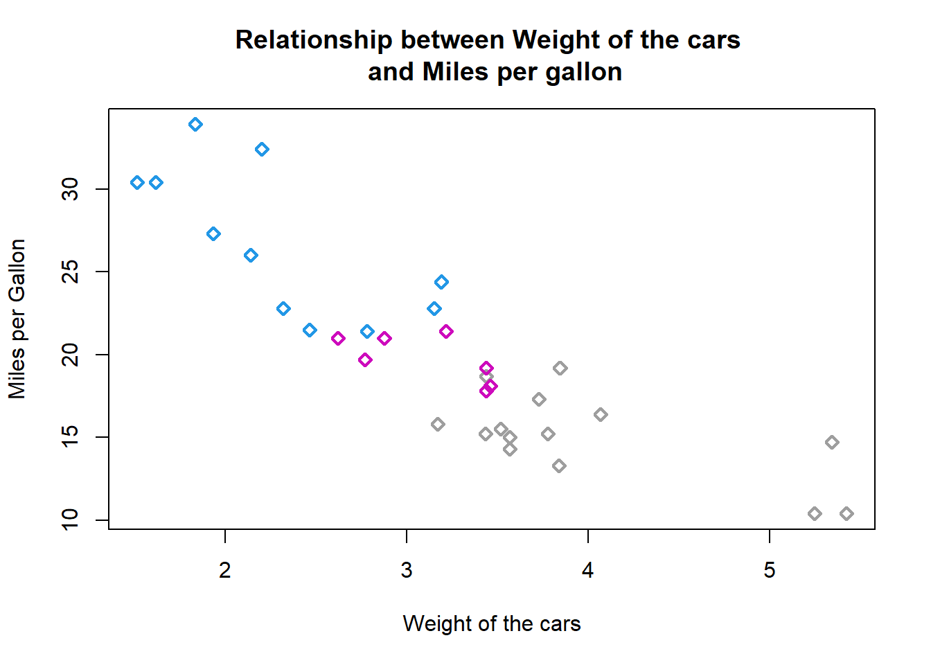
In the scatter diagram, we can also tick a line on the graph to indicate some threshold or to highlight the cut off point for the dataset. This can be done by using “abline” function after we perform the graph.
For example, to create a horizontal line at Miles per gallon = 20 and color the line with “red” color.
plot(mtcars$wt, mtcars$mpg,
     main="Relationship between Weight of the cars \n and Miles per gallon",
     xlab = "Weight of the cars",
     ylab = "Miles per Gallon",
     pch = 23,
     lwd = 2,
     col = "#F7A012")

abline (h= 20, col = "red")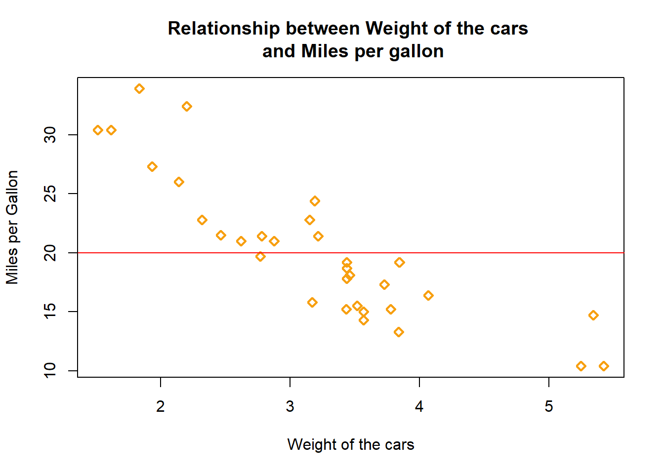
To create a vertical line at Weight = 3.5 and color the line with “blue” color.
plot(mtcars$wt, mtcars$mpg,
     main="Relationship between Weight of the cars \n and Miles per gallon",
     xlab = "Weight of the cars",
     ylab = "Miles per Gallon",
     pch = 23,
     lwd = 2,
     col = "#F7A012")

abline (v = 3.5, col = "blue")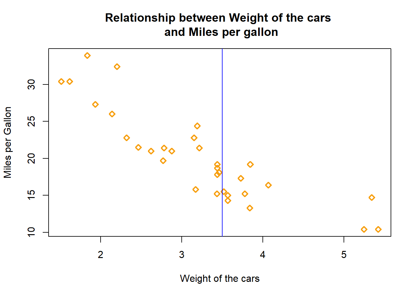
Next, we can also draw a linear regression line on the scater plot. Firstly, we need to develop a linear regression model, then plot the scatter diagram and input the line.
#adding linear regression line
mod1 <- lm(mtcars$mpg ~ mtcars$wt)
summary(mod1)
Call:
lm(formula = mtcars$mpg ~ mtcars$wt)

Residuals:
    Min      1Q  Median      3Q     Max
-4.5432 -2.3647 -0.1252  1.4096  6.8727

Coefficients:
            Estimate Std. Error t value Pr(>|t|)
(Intercept)  37.2851     1.8776  19.858  < 2e-16 ***
mtcars$wt    -5.3445     0.5591  -9.559 1.29e-10 ***
---
Signif. codes:  0 '***' 0.001 '**' 0.01 '*' 0.05 '.' 0.1 ' ' 1

Residual standard error: 3.046 on 30 degrees of freedom
Multiple R-squared:  0.7528,    Adjusted R-squared:  0.7446
F-statistic: 91.38 on 1 and 30 DF, p-value: 1.294e-10plot(mtcars$wt, mtcars$mpg,
main="Relationship between Weight of the cars \n and Miles per gallon",
xlab = "Weight of the cars",
ylab = "Miles per Gallon",
pch = 23,
lwd = 2,
col = "#F7A012")
abline (a = 37.2851, b = -5.3445, col="blue") 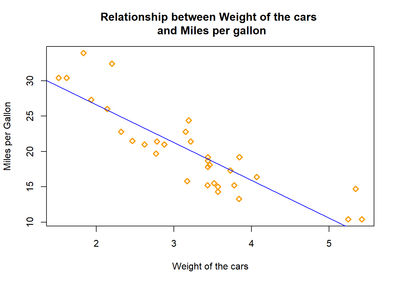
#a is intercept, b = slopeTo make a line graph using “plot” function, we will pass a vector of x values and a vector of y values and use “type” argument by setting it to “l”.
For this purpose, we will illustrate the plot using “pressure” dataset. The dataset is ready dataset in R environment from dataset package.
data(pressure)

plot(pressure$temperature, pressure$pressure,
     type = "l",
     main = "A line chart showing relationship \n between pressure and temperature",
     xlab = "Temperature",
     ylab="Pressure",
     col="blue")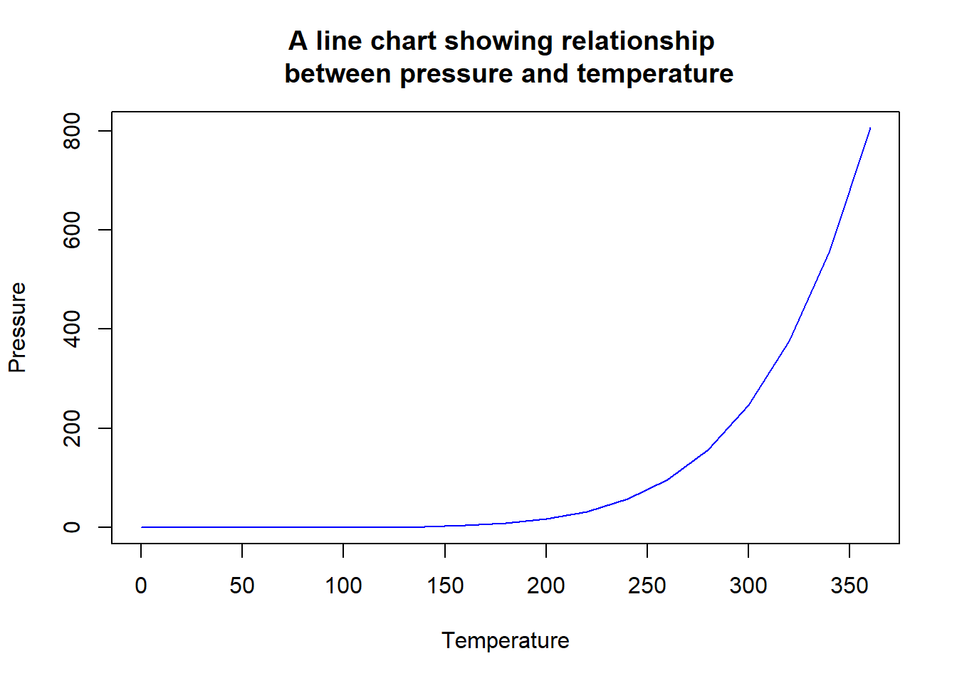
We can also combine the line chart with point shape by changing the type argument to “b”.
plot(pressure$temperature, pressure$pressure,
     type = "b",
     pch=2,
     main = "A line chart showing relationship \n between pressure and temperature",
     xlab = "Temperature",
     ylab="Pressure",
     col=rainbow(4))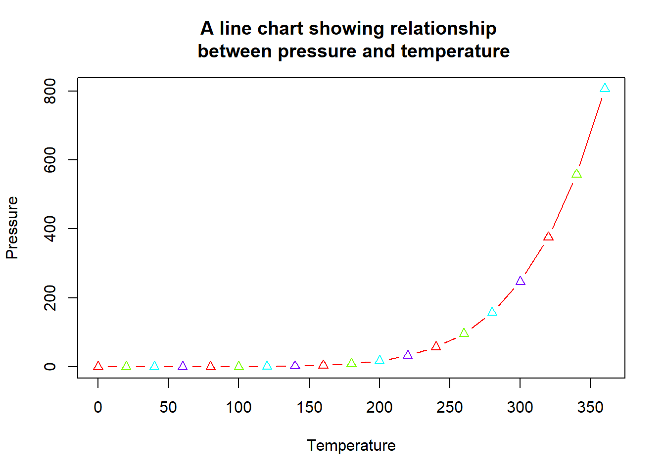
As in line chart, we can also change the tickness of the line by changing the value of “lwd” (higher the value means more ticker the line).
In the line chart, the type of the line can be change as well by using “lty” argument.
plot(pressure$temperature, pressure$pressure,
     type = "l",
     pch=2,
     lwd = 2, #for point tickness
     lty = 3, # for line type
     main = "A line chart showing relationship \n between pressure and temperature",
     xlab = "Temperature",
     ylab="Pressure",
     col=rainbow(4))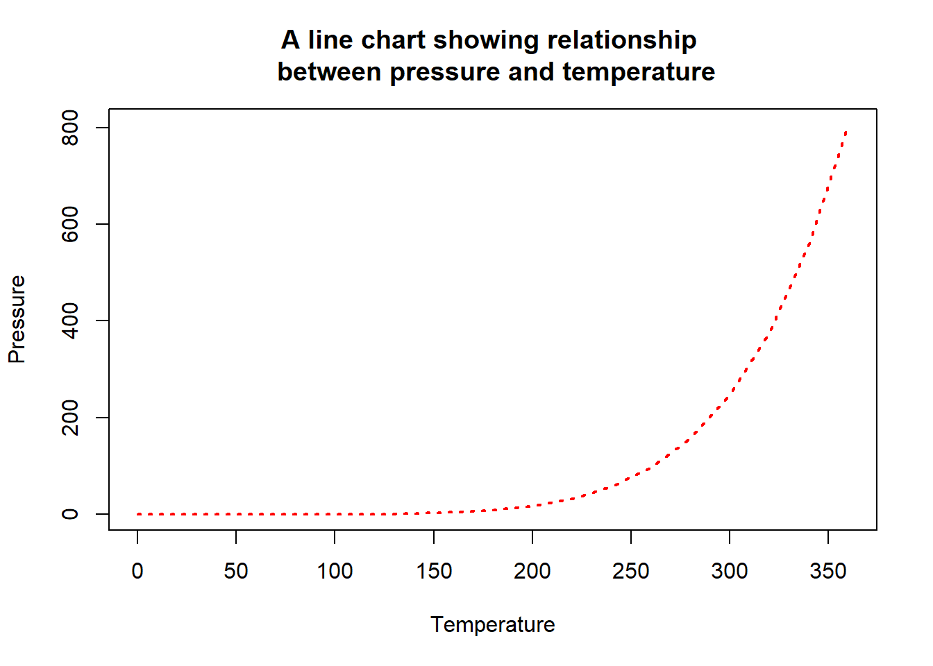
The example of type of line available are as follows

To make a bar graph, we will use “barplot” function and it pass a vector of values for the height of each bar and (optionally) a vector of labels for each bar. If the vector has names for the elements, the names will be automatically be used as labels.
mtcars, we want to create a bar chart from this variable. Noticed that, the variable (cyl in mtcars) is not an aggregate variable. Thus in creating the bar chart, we need to make it as aggregate dataset before ploting the graph.barplot(table(mtcars$cyl))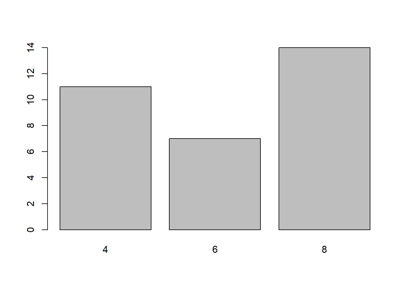
This is another example of creating bar plot by combining all the argument that we have discussed in previous section.
par(mfrow = c(1,2))

barplot(table(mtcars$cyl),
        main="Bar Chart showing \n distribution of cyl",
        xlab = "number of cylinder",
        ylab = "number of cars",
        col = "pink",
        border = NA)  # eliminates borders around the bars)

barplot(table(mtcars$cyl),
        main="Bar Chart showing \n distribution of cyl",
        xlab = "number of cylinder",
        ylab = "number of cars",
        #col = rainbow(4), #grey.colors(3),
        col = c("#E69F00", "#56B4E9", "#009E73"),
        border = NA)  # eliminates borders around the bars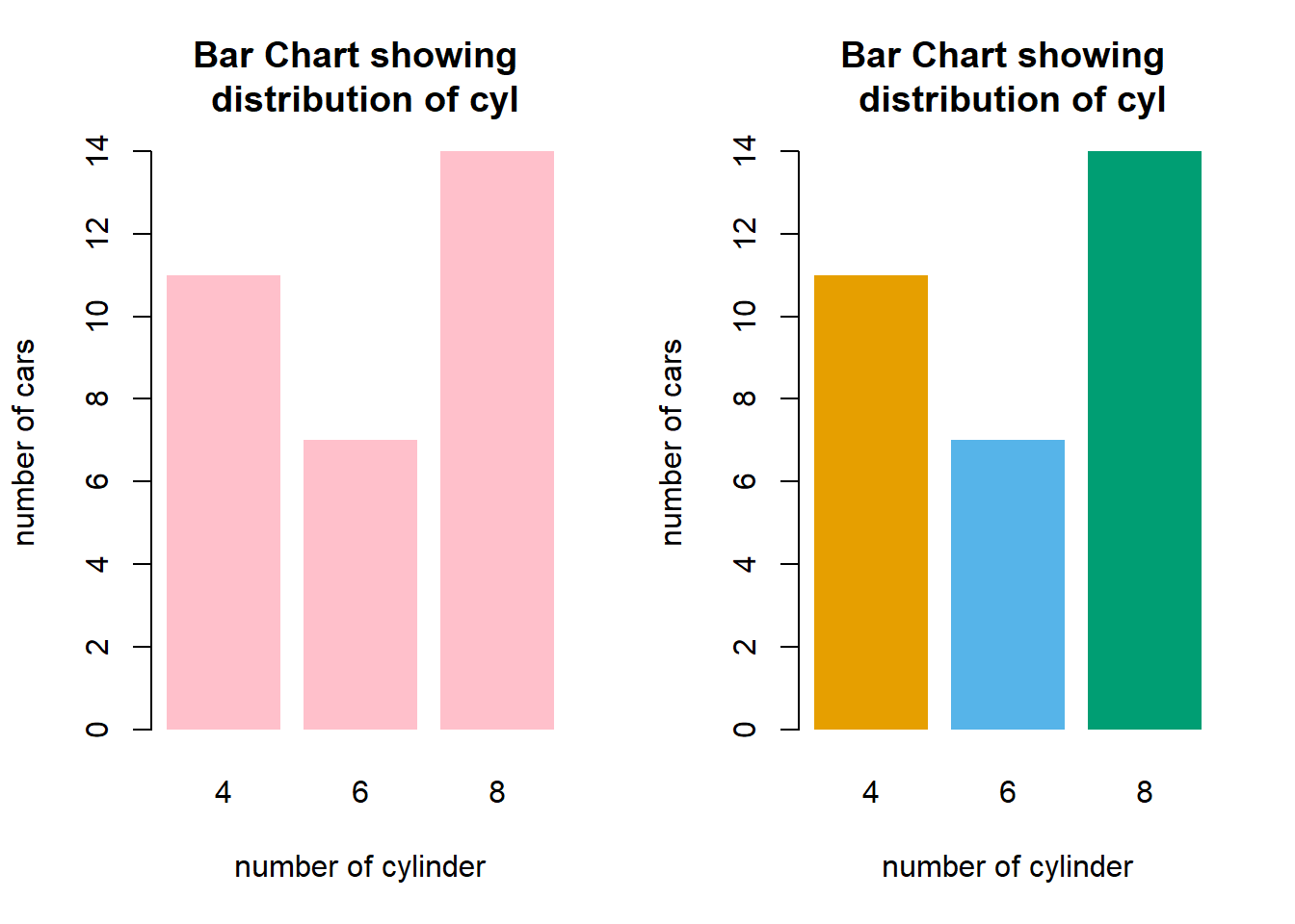
We can easily change the orientation of bar chart to horizontal by adding “horiz” argument in the function.
barplot(table(mtcars$cyl),
        main="Bar Chart showing distribution of cyl",
        xlab = "number of cylinder",
        ylab = "number of cars",
        col = "#B5A2F9",
        border = NA,   # eliminates borders around the bars)
        horiz = T)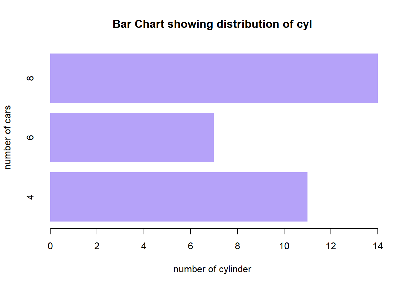
To input data value on the bar graph, we will use “text” function after generating the bar plot. In “text” function, we should specify the following argument:
pos” is the position specifier for the text (1: below, 2:left, 3: above, 4: right)offset” is the value to control the distance of the text label from the specified coordinate in fractions of a character width.cex” is a size of the texta <- barplot(table(mtcars$cyl),
main="Bar Chart showing distribution of cyl",
xlab = "number of cylinder",
ylab = "number of cars",
col = "#F76384",
border = NA)
text(a,
y = table(mtcars$cyl),
label = table(mtcars$cyl),
pos = 3,
offset= -1,
cex= 0.8 )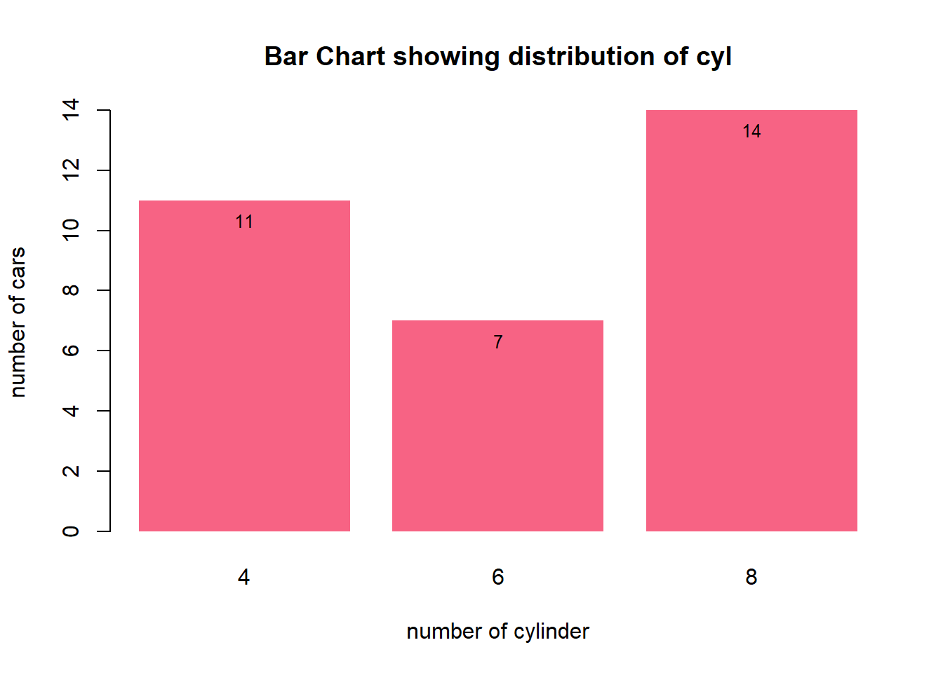
To make histogram, we will use “hist” function and pass it a vector of values.
for example:
hist(mtcars$mpg)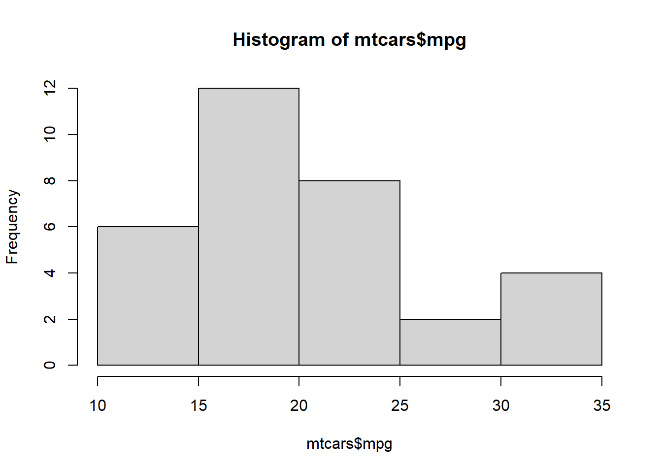
By default, in developing histogram graph using “hist” function, the data will be breaks using “sturge rule” formula where it will create a multiple class with equal class size from the dataset.
We can manually adjust the number of class to be created in histogram by adjusting “breaks” argument in the hist function.
hist(mtcars$mpg, breaks = 10)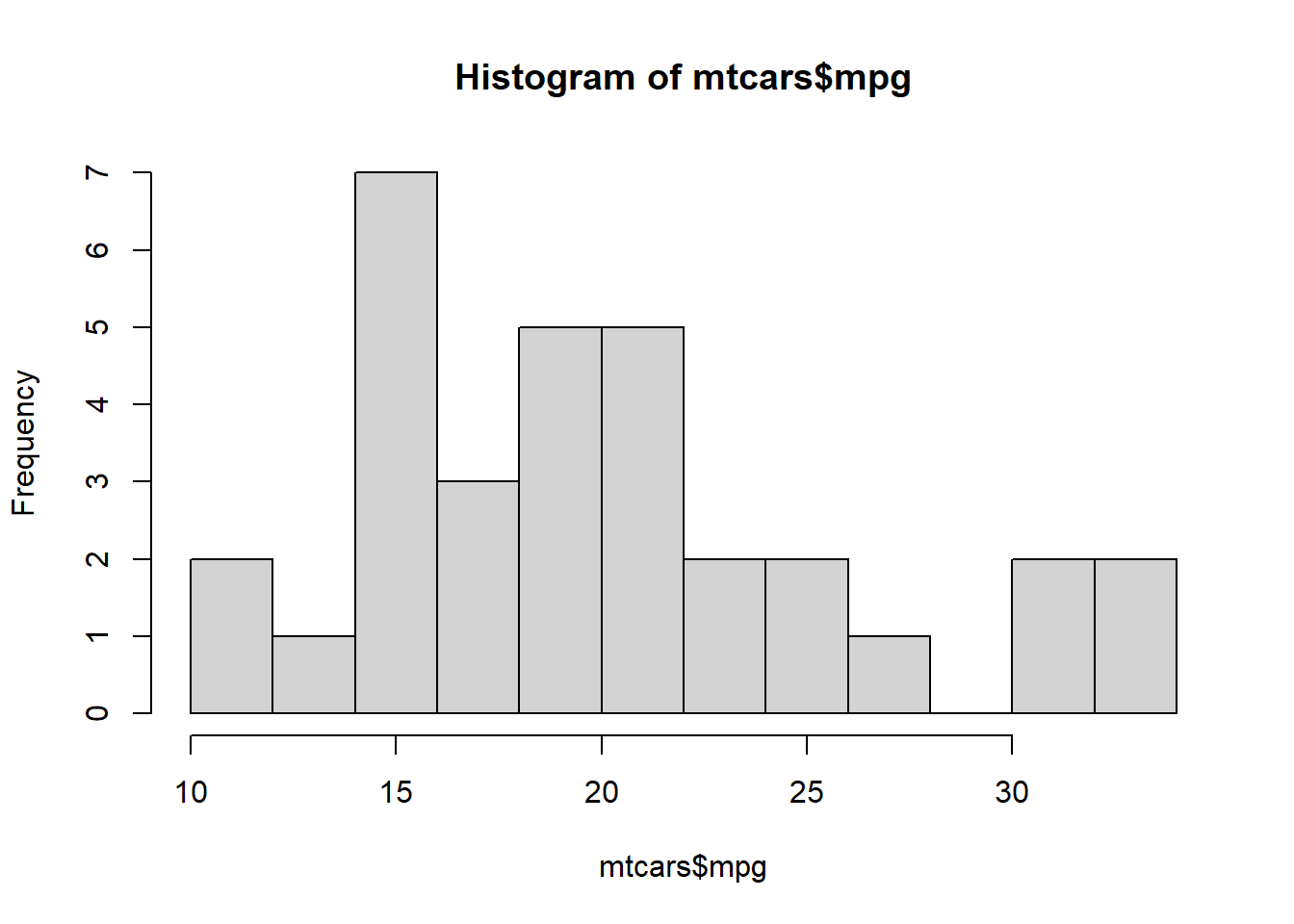
We can actually add colour onto each bar in histogram by using “col” argument.
#let's create a dummy data BMI
BMI <- rnorm(n=1000, m=24.2, sd=2.2) #m=mean, sd=standard deviation
hist(BMI)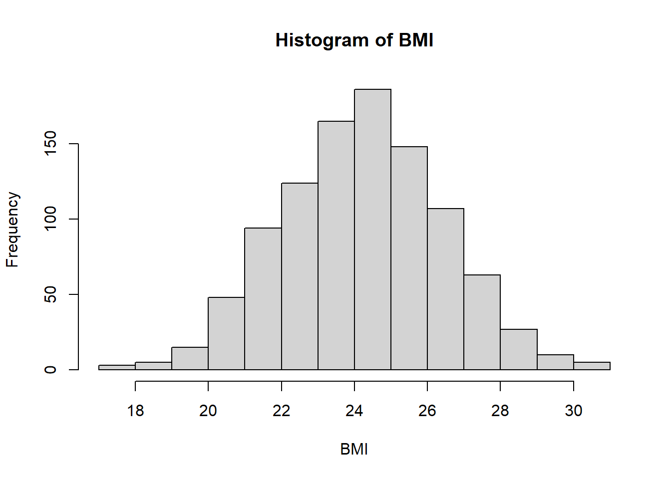
adding colour in the bar
pal <- colorRampPalette(colors = c("lightblue", "blue"))(30)

hist(BMI, breaks=20,
     main="Histogram showing distribution of BMI",
     col = pal)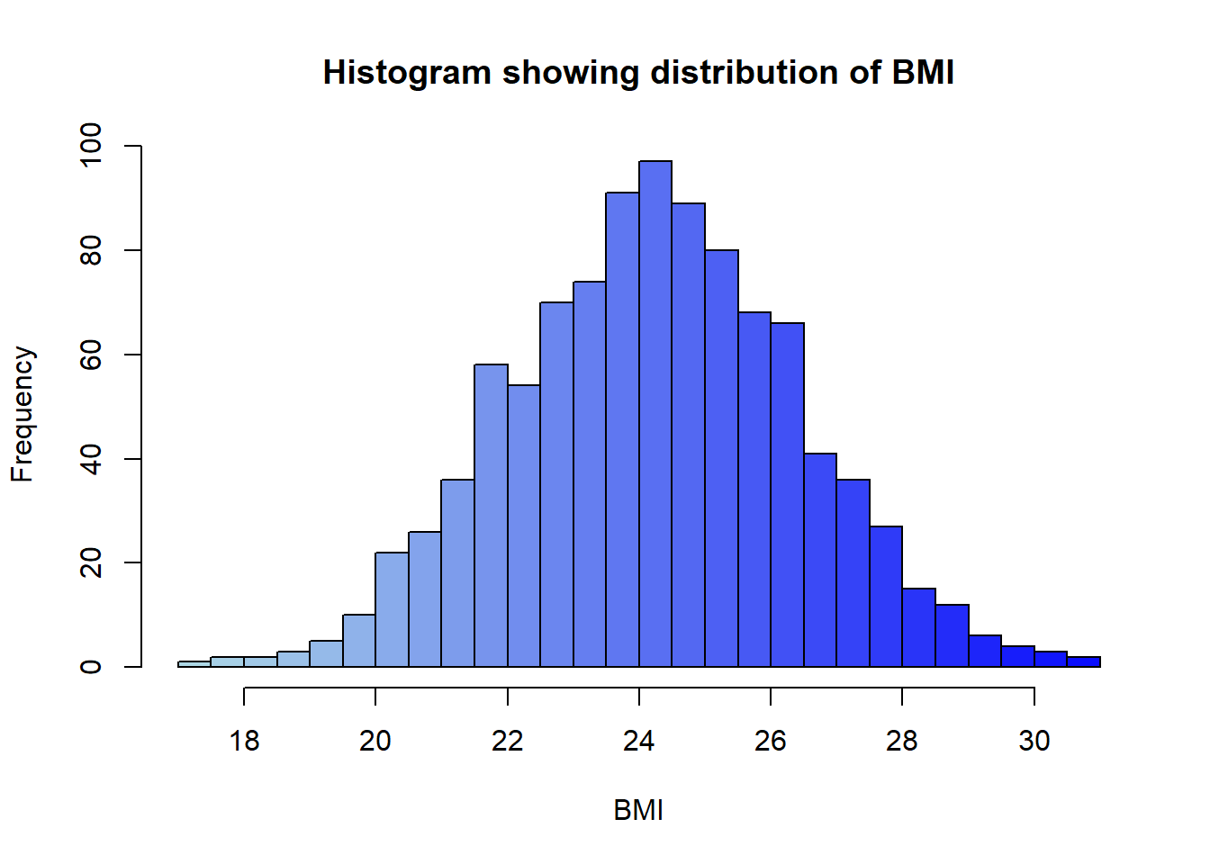
To add the normal curve on the histogram, we can use “curve” function after generating the histogram. In Curve function, we need to specify “dnorm” function to indicate that we want to generate normal distribution value.
hist(BMI, breaks=20, freq = F, col="azure1") #first create histogram

#Then draw the curve
curve(dnorm(x,
            mean=mean(BMI),
            sd=sd(BMI)),
      add=TRUE,
      col="darkblue",
      lwd=2)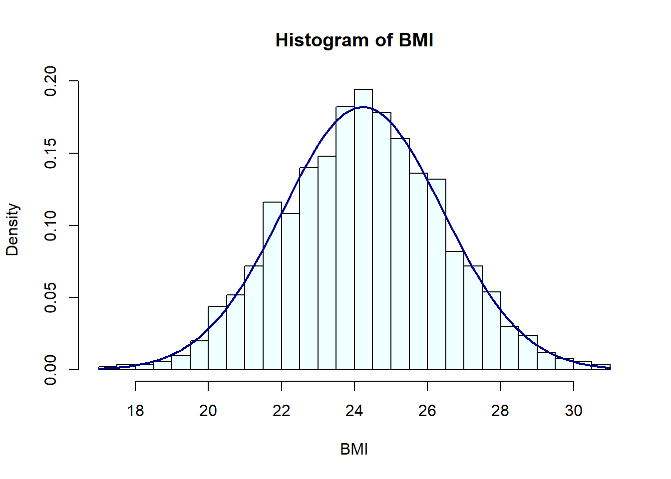
To make a box plot, we will use “boxplot” function and pass it a factor of x values and a vector of y value. When x is a factor, it will automatically create a boxplot.
creating boxplot for single numerical variable
boxplot(mtcars$mpg)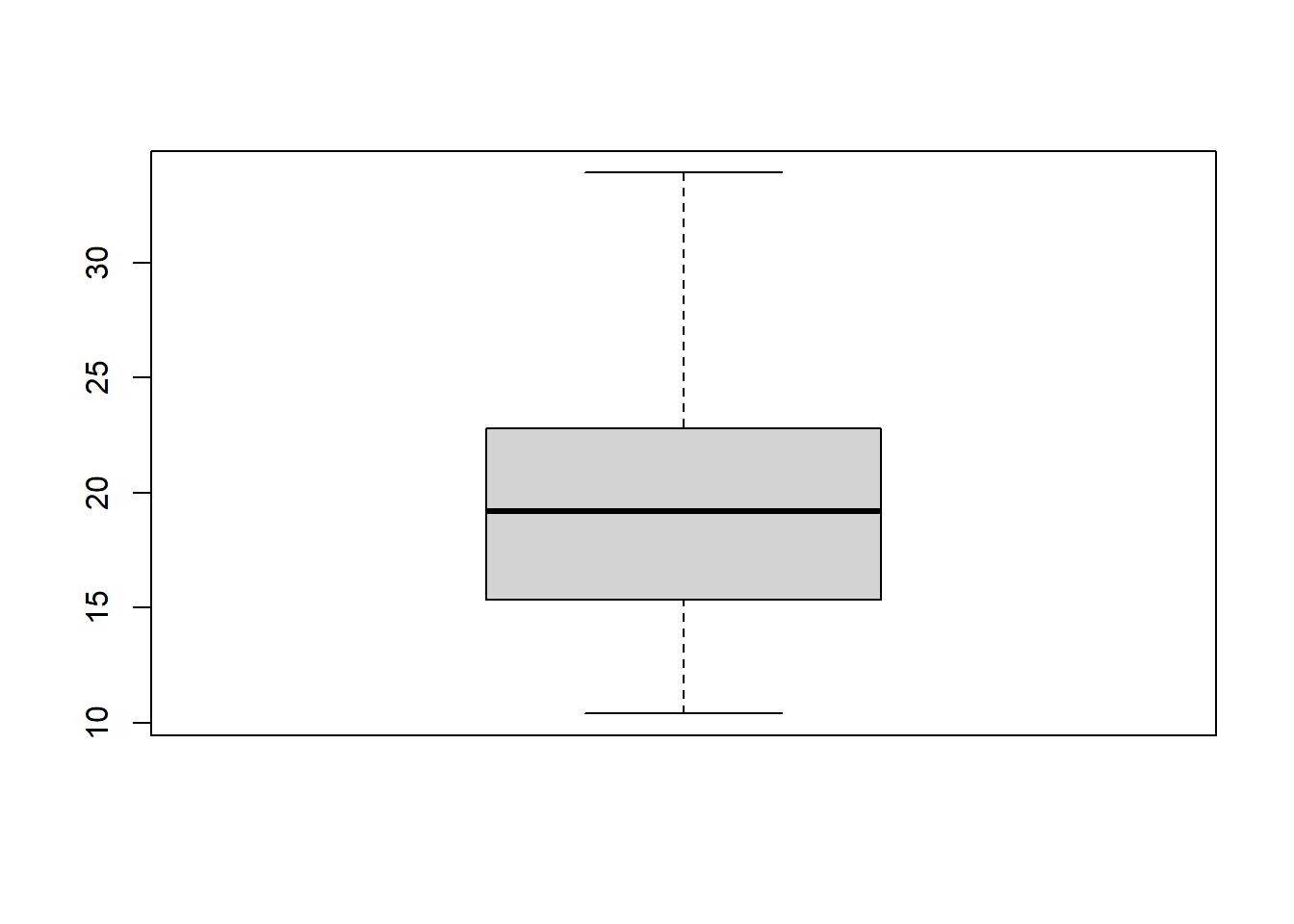
Creating boxplot for 1 quantitave variable and 1 qualitative variable. This is to see the shape of data distribution based on categorical variable
boxplot(mtcars$mpg~mtcars$cyl,
        col=c("beige", "cornsilk2", "bisque2"),
        main="Boxplot showing distribution of MPG by CYL")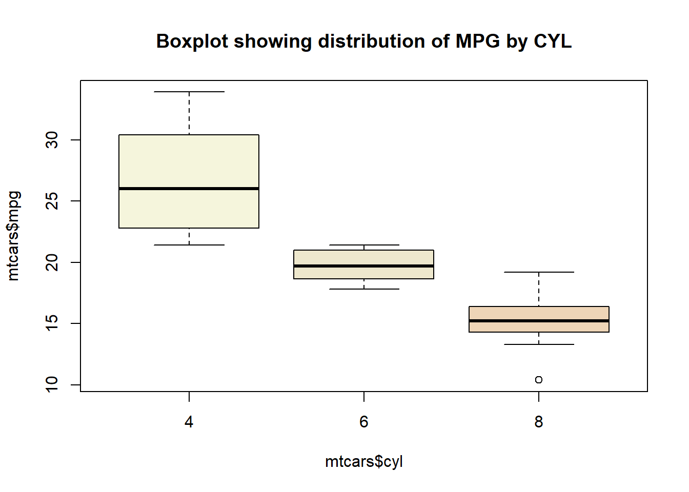
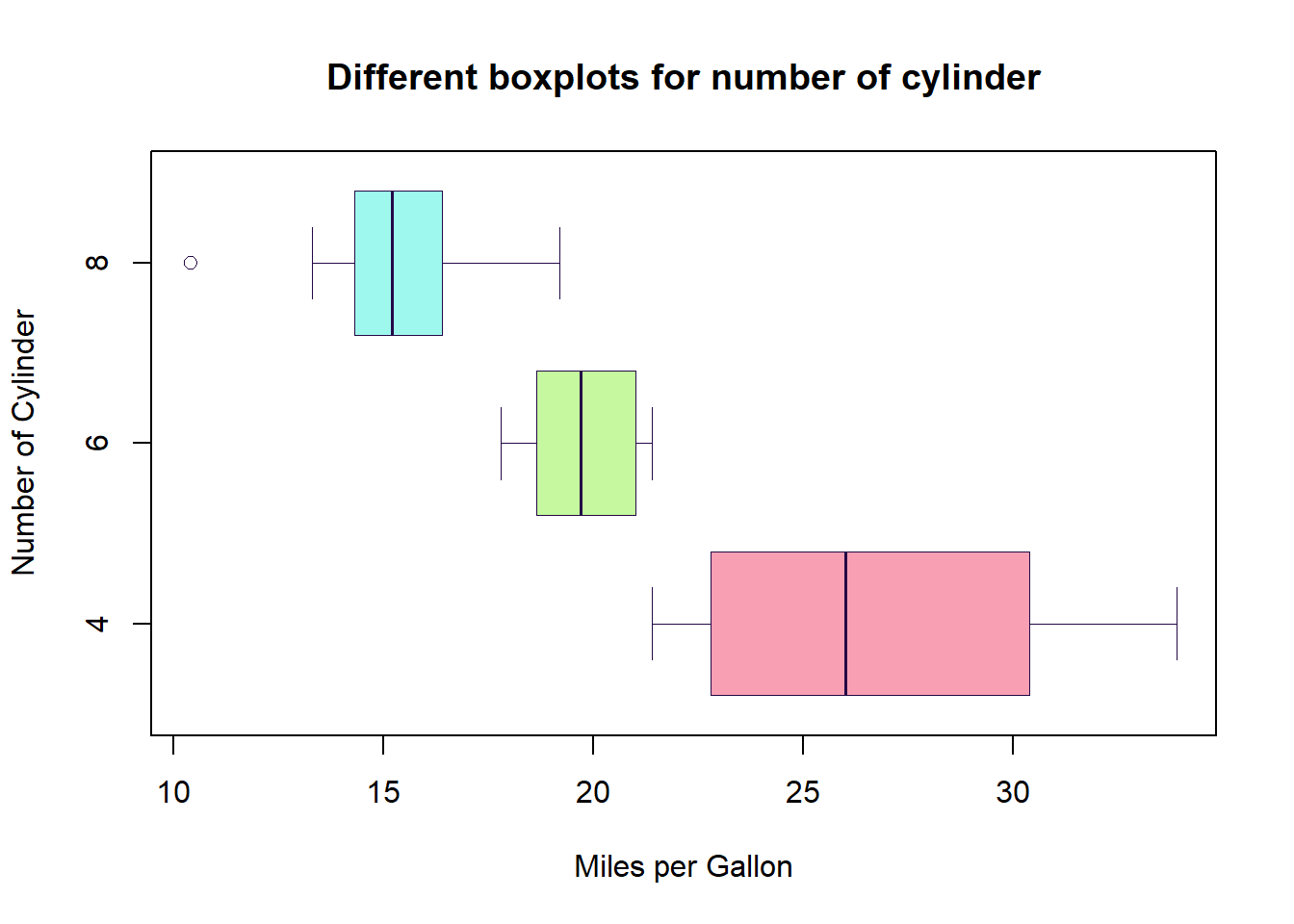
Making horizontal boxplot (horizontal)
boxplot(mpg~cyl,
        data=mtcars,
        main="Different boxplots for number of cylinder",
        xlab="Miles per Gallon",
        ylab="Number of Cylinder",
        col=c("#F89FB3", "#C5F89F", "#9FF8ED"),
        border="#240947",
        horizontal = T,
        lty = 1,
        lwd = 0.6)